In short
- Lettering blurs before almost any other design, because the small spaces inside letters like a, e and o are the first to fill in as ink slowly spreads in the skin.
- Four things decide whether a font survives: letter height (measure the small letters, not the whole word), stroke weight, open inner spaces and generous spacing between letters, words and lines.
- Single-needle script looks delicate but needs more size to last. Simple, even-weight script, clean print letters and bold lettering age better than hairline calligraphy.
- For a long quote, add lines instead of shrinking the letters, and check the stencil for spelling, spacing and how the words sit when you move.
In this article 11
- Why words blur before anything else
- The four things that decide whether a font survives
- Which lettering styles hold up and which are risky
- Single-needle script or bolder lettering?
- How long can a quote be at a given size?
- Placement for words and names
- Handwriting tattoos
- What to check on the stencil
- How script tattoos age, and how to help them
- Before you book
- Frequently asked questions
Nora had the word picked out for years: her grandmother’s way of signing every birthday card, copied from an old envelope. She wanted it on the inside of her wrist, small and delicate, in a hair-thin line like the ones all over her feed. Her artist looked at the photo, measured her wrist and said something she did not expect: “I can do it this small. But in ten years you won’t be able to read it.”
That is the honest problem with script tattoos. Words are among the most requested tattoos and among the ones that age worst, not because lettering is a bad idea, but because letters are made of exactly the kind of detail skin does not keep forever. This guide is about lettering only: which typefaces hold up, how big the letters need to be, single-needle script versus bolder lettering, where words sit best, how long a quote can be, handwriting tattoos and what to check on the stencil. For fine line in general, see our guide to how fine line tattoos age; for size across all designs, see the tattoo size guide.
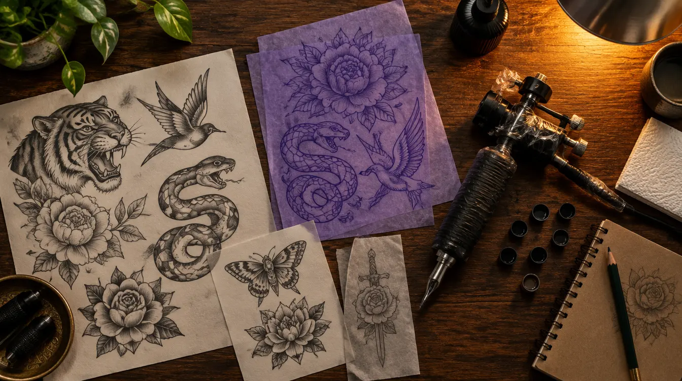
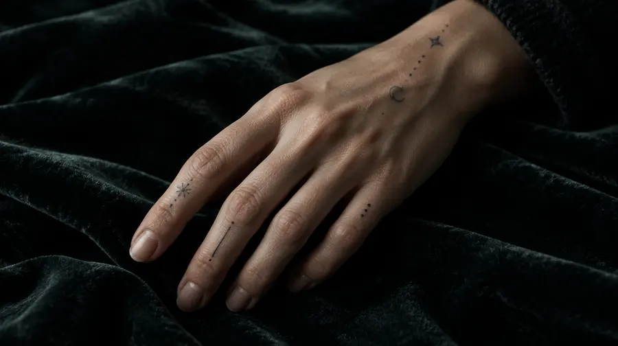
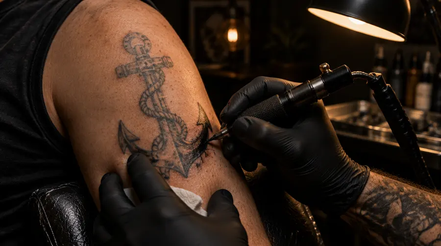
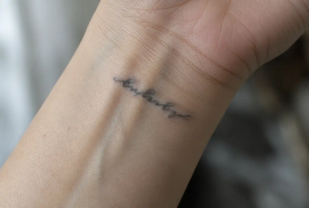
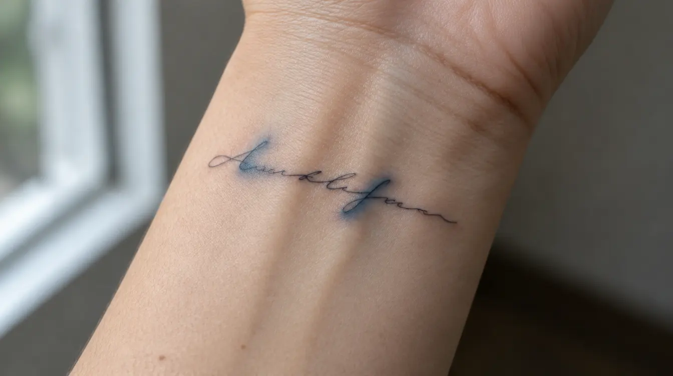
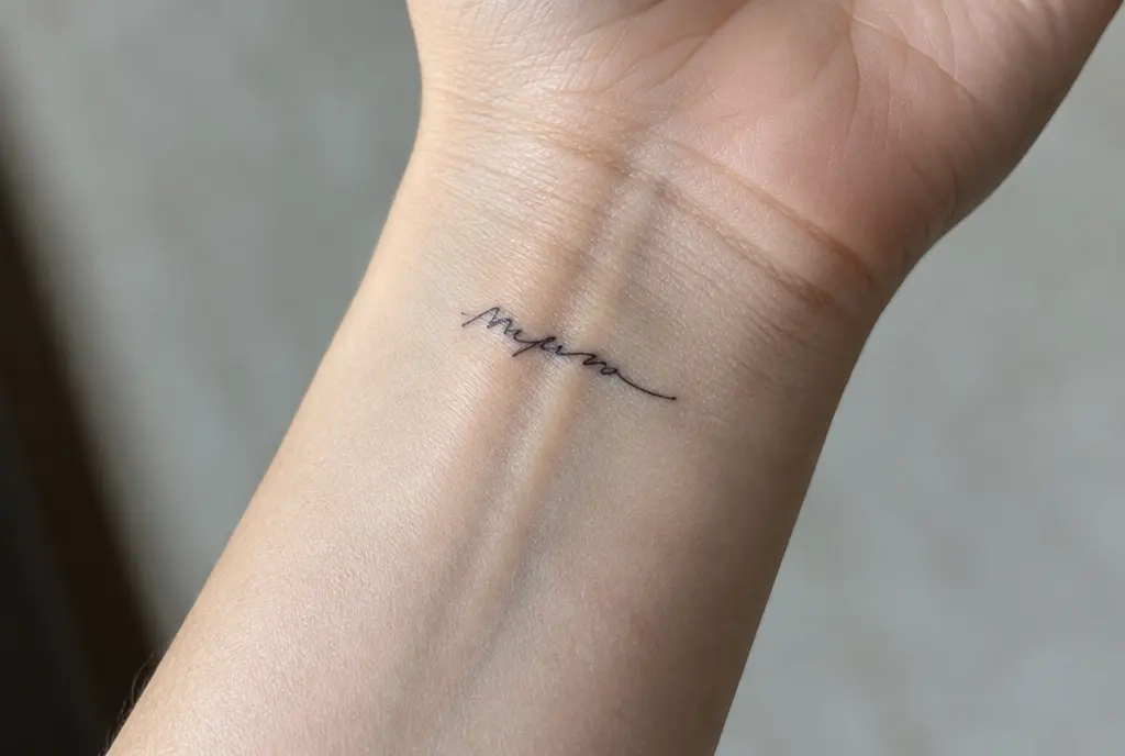
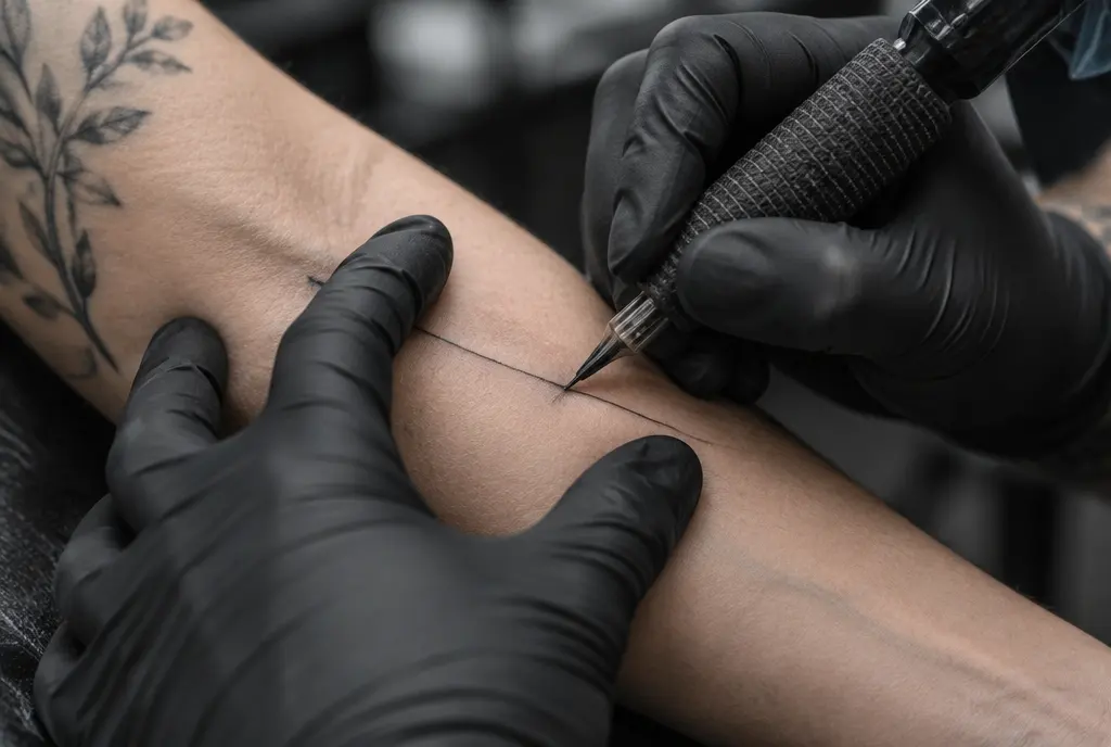
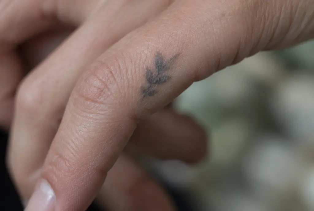
> A note on the pictures: the images in this article are illustrations made to show typical situations. They are not photos of real people or real tattoos.
Why words blur before anything else
Tattoo ink does not sit still. The pigment is held by immune cells in the dermis, called macrophages. A 2018 study in mice showed that these cells capture the ink, die off and release it, and new cells pick it up again, over and over. Researchers think tiny amounts escape in each cycle. Add years of sun and the skin’s own aging, and every line slowly gets a little wider and a little softer.
For a flower or a symbol, a line that is a fraction of a millimetre wider hardly matters. For a letter it can change everything. You read words by the small shapes inside them: the eye of an e, the bowl of an a, the gap between r and n. When those spaces fill in, an e becomes a dot, rn starts to look like m, and a word becomes a grey line with a few bumps.
A word tattoo is only as readable as its smallest gap: when the inside of the e fills in, the whole word goes with it.
This is why the same design can age so differently at two sizes. Spread is roughly the same in millimetres whatever the size of the letter, so a tenth of a millimetre on a 3 mm letter is a big change, while on a 10 mm letter it barely shows.
The four things that decide whether a font survives
When you choose a font for a tattoo, you are not really choosing a style. You are choosing four measurements, and each one has a minimum.
1. Letter height: measure the small letters
Most people measure the whole word, but the number that matters is the height of the lowercase letters, what designers call the x-height: how tall an a, e or o is. Capitals and tall letters like h or l can be twice that, and they do not tell you much.
There is no official minimum, and artists’ numbers differ, so treat these as rough guides. The rule used in our size guide is letters about 1 cm tall for most lettering. Very simple, even print letters can sometimes go a little smaller in skilled hands, but many artists treat around 5 mm of lowercase height as a bare floor, and delicate script with loops usually needs more, often closer to 7–10 mm. Busy spots that rub, stretch or get sun, such as hands, feet and the inner wrist, need a little extra on top.
2. Stroke weight: the thinnest part of the letter counts
Many popular script fonts have high contrast: thick down-strokes and almost invisible hairline up-strokes. On paper that looks elegant. In skin, the hairlines are the first to fade, and the thick parts are the first to spread into the spaces next to them. Fonts with an even line weight, where every part of the letter is roughly the same thickness, age far more predictably.
3. Open counters: room inside the letters
The closed or nearly closed spaces inside letters are called counters. Look at the a, e, o, g, d and any loop in the script. If the opening is smaller than about a millimetre, it is likely to close up over the years. Fonts with round, open letters, short ascender loops and no tiny curls hold their shape best. Your artist can often open up a font by hand, keeping its character while giving each letter more room.
4. Spacing: between letters, words and lines
Tight letter spacing and connected script where letters touch at many points blur into each other first. Leave visible space between letters, a clear gap between words, and at least as much space between lines as the letters are tall. Our fine line guide suggests asking for at least 1–2 mm between lines in dense detail; for lettering, more is better.
Which lettering styles hold up and which are risky
Font names change with every trend, so it helps more to recognise types of lettering than to memorise names.
Styles that usually age well
- Simple, even-weight script. Rounded handwriting with a steady line, generous loops and letters that connect at only one point. This is the safest choice if you want cursive.
- Clean print letters. Upright letters without serifs, or simple typewriter-style letters, with open shapes and wide spacing. Easy to read, easy to keep sharp.
- Bold script. Traditional tattoo script and chicano-style lettering use thicker lines on purpose. They lose a little crispness over the years but stay readable for a very long time.
- Blackletter and gothic lettering, done large. Strong, dense letters that work well big, for example across the chest or the back. At small sizes their narrow gaps close quickly.
Styles that need care
- Hairline calligraphy with very thin up-strokes and heavy contrast.
- Tiny cursive where every letter is joined by a long thin stroke.
- Condensed fonts, where letters are tall and squeezed together with almost no space inside them.
- Decorative fonts with small curls, swashes and dots that sit close to the letters.
None of these are forbidden. They just need more size, more spacing or a bolder line than most people expect, and you should go in knowing they will soften first.
Single-needle script or bolder lettering?
Fine line lettering is usually done with a single needle (1RL) or a very small round grouping of three (3RL). A single tattoo needle is roughly 0.25–0.35 mm thick, depending on the type, so a single-needle line starts out about as thin as a line can be in skin.
That is exactly why it looks so delicate when fresh, and why it has the least room to spare. A single-needle word tends to fade and soften earlier, and touch-ups cannot fully reverse spread: going over a line that has already widened adds more ink, not more sharpness. A slightly heavier line, from a 3RL or 5RL, looks almost as fine to most people from a normal distance and holds its shape noticeably longer.
A good middle ground many artists suggest: keep the delicate look, but ask for the main strokes a little heavier than the very finest needle, and make the letters slightly bigger than your first instinct. You lose very little of the style and gain years of readability.
How long can a quote be at a given size?
This is the question most people ask too late, after they have fallen in love with a long line of text. A useful rule of thumb: in most fonts, each character, including spaces, takes up roughly 0.6 to 0.8 times the letter height in width, and script often a little more.
- One word of 6–8 letters with 1 cm letters: about 5–8 cm long. Fits the inner forearm, the collarbone or along the side of the foot.
- A short phrase of 15–20 characters: about 10–15 cm on one line. Works on the forearm, the spine or the ribs, or split into two lines on the inner arm.
- A full quote of 40–60 characters: 25–40 cm on a single line, which is longer than most forearms. Plan it as three or four lines, or choose a larger area such as the back, the thigh or the upper arm.
If the text does not fit at a readable size, the fix is never smaller letters. Shorten the text, break it into more lines or move it to a bigger area. A long quote that becomes a grey stripe loses its meaning; three strong words that stay sharp keep it.
Placement for words and names
Lettering follows the same placement logic as any tattoo, with two extra questions: will the line of text stay straight when you move, and who is meant to read it?
- Inner and outer forearm. One of the best spots for words. Fairly flat, easy to see, and the text can run along the arm. Decide early whether it should read the right way up for you or for the person facing you.
- Collarbone and upper chest. Good for one line following the curve of the bone. Very short words only directly on the bone.
- Ribs and side. Popular for quotes, and the skin is fairly soft, but it moves with breathing and changes with weight. Lines tend to bend, so keep the text shorter than you want and the letters bigger.
- Along the spine. Elegant for a vertical word or short phrase, but it needs a straight layout and an artist used to working vertically.
- Inner wrist. Classic for a name or date, but a small, much-used area. Keep it to one short word with letters big enough.
- Fingers, sides of the hands and feet. Fast-renewing, rubbing skin. Letters here blur and fade fastest, as our hand and finger tattoo guide explains.
On a limb, text almost always looks best running along the length of the arm or leg, centred on the area, not wrapped around it. Text that wraps around a forearm can only be read by turning the arm.
Handwriting tattoos
A word in the handwriting of someone you love is one of the most meaningful tattoos there is, and it comes with its own technical challenge. Handwriting was never designed for skin: it was written with a ballpoint, a fountain pen or a pencil, at its own random size, with thin wobbly lines.
- Find the best sample. Several signatures or cards from the same person give your artist options. Pick the one where the letters are clearest, not just the most sentimental.
- Scan or photograph it flat and sharp. A high-resolution scan lets the artist enlarge it without guessing where a stroke starts and ends.
- Expect the lines to be re-drawn. A ballpoint line copied exactly would look like a scratch in skin. A good artist traces the writing, keeps the shape and rhythm, evens out the line weight and opens up tiny loops.
- Let it be bigger than the original. Real handwriting is often 3–5 mm tall. In skin it usually needs to be enlarged two or three times to stay readable.
- Keep the character, fix the risks. Wobbles and quirks are what make it personal. Overlapping letters and closed loops are what make it blur. Ask your artist to keep the first and gently fix the second.
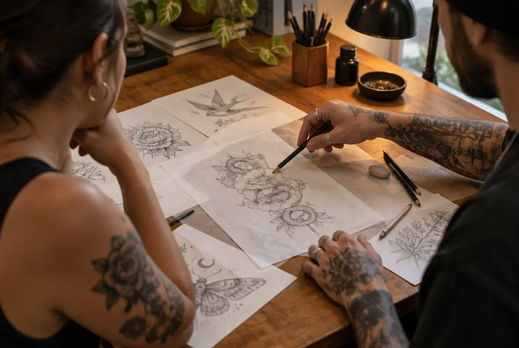
Nora’s artist did exactly this. He enlarged her grandmother’s word so the small letters were about 8 mm tall, opened the closed loop of the e and moved it from the inner wrist to the inner forearm, where it runs along the arm. It still looks like her grandmother wrote it.
What to check on the stencil
The stencil is the last moment you can change anything, and with lettering most mistakes are visible right there. Take your time, even if the studio is busy.
- Spelling, letter by letter. Read it backwards, one letter at a time. Check names, dates, accents and any word in a language you do not speak with a native speaker before the appointment.
- The inside of every letter. Look at each a, e, o and loop. Is there clear skin inside? If not, ask for it to be opened now, not later.
- Spacing. Are the letters, words and lines clearly separate? Are any two letters almost touching?
- A straight baseline in real life. Stand naturally, let your arm hang, then lift and rotate it. Text that looks straight on a flat arm can curve when you move.
- The reading direction. Is it the right way up for the person you want to read it?
- Distance. Look at it in a mirror from one to two metres away. If you struggle to read it now, it will be harder in ten years.
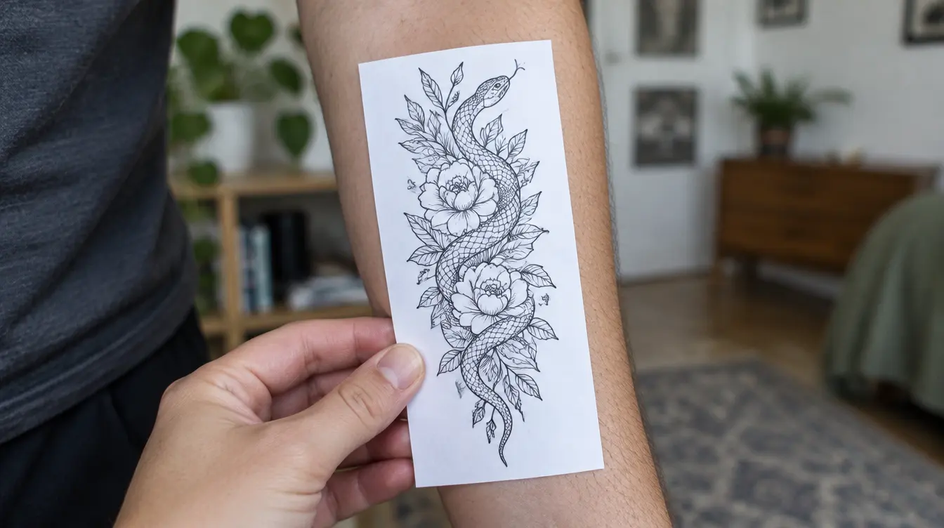
How script tattoos age, and how to help them
Even well-designed lettering softens. Over the first years the lines settle and get a little wider; over decades contrast drops and edges blur. Most of the difference between a word that stays sharp and one that does not is decided before the first line, by size, font and spacing. After that, two habits help most.
- Sun protection. UV light fades pigment and ages the skin around it. Once healed, use a broad-spectrum sunscreen of SPF 30 or higher on visible lettering.
- Smart touch-ups. A touch-up can bring back faded or patchy parts, especially in fine line. It cannot make a line thinner again, so do not expect it to rescue letters that were too small to begin with.
Before you book
A script tattoo that lasts is not about giving up the delicate look. It is about choosing a font with open letters and an even line, giving the small letters at least about 7–10 mm for script and around 1 cm as a general rule, keeping space around every letter, and putting the words where they can stay flat and protected.
If you want to see how your lettering might look in ten, thirty or fifty years before you decide on the size, InkAge can show you an aged preview from a photo. It is an estimate, not a promise, but it makes it easier to see whether your word will still read as a word.
Frequently asked questions
What is the smallest size for a script tattoo?
There is no official minimum. As a rough guide, aim for letters about 1 cm tall. Many artists treat around 5 mm of lowercase height as a bare floor for simple print letters, while delicate script with loops usually needs closer to 7–10 mm to stay readable for many years.
Which tattoo lettering fonts age best?
Fonts with an even line weight, open letters and generous spacing: simple rounded script, clean print or typewriter letters, and bold traditional or chicano script. Hairline calligraphy, tiny connected cursive and condensed or very decorative fonts blur first.
Do single-needle script tattoos last?
They can, but they have the least room to spare. A single needle is only about 0.25–0.35 mm thick, so the line fades and softens earlier than heavier lettering. Bigger letters, open loops and wide spacing make the biggest difference.
Can a blurry script tattoo be fixed?
Partly. A touch-up can refresh faded or patchy letters, but it cannot make widened lines thin again. If the inside of the letters has filled in, the usual options are reworking it into bolder lettering, a cover-up, or fading it with a laser first.
How many words fit on a forearm?
On one line with letters about 1 cm tall, roughly 15–25 characters, so a short phrase of two to four words. For a longer quote, use several lines or a bigger area such as the upper arm, the back or the thigh, instead of making the letters smaller.
Sources
- Baranska et al., Journal of Experimental Medicine (2018): Unveiling skin macrophage dynamics explains both tattoo persistence and strenuous removal
- Business Insider: Tattoo artists share 7 mistakes people make when getting word or number tattoos
- Business Insider: Tattoo artists share 8 mistakes people make when getting wrist tattoos
- BV Shop: Tattoo needle sizes explained
- Healio: AAD dermatologist offers tips for tattoo care
Written by the InkAge editorial team from widely accepted tattoo-care practice. Figures are rules of thumb, not measurements. This is general information, not medical advice — ask your artist or a dermatologist about your own skin.
Last updated: 22 November 2026