In short
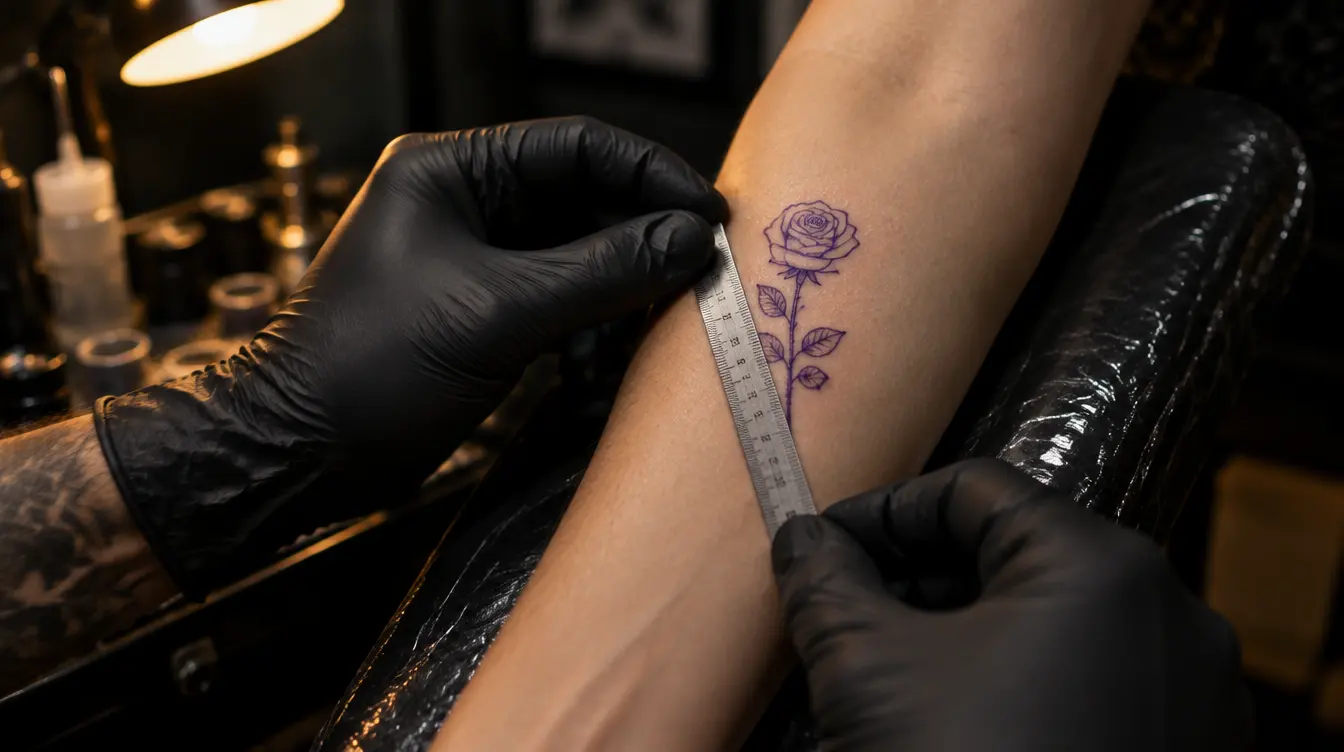
- Lines spread by roughly 0.1 mm per decade – on a small design that matters far more than on a large one.
- The minimum size is set by the design’s smallest detail: gaps narrower than 1 mm typically merge within 10–15 years.
- Simple symbol: 3–5 cm; lettering: letters at least about 1 cm tall; detailed piece: 8 cm or more; realism: often much more.
- Test the size on your skin with a printout or in InkAge, and check the 30-year preview before you decide.
In this article 12
- Why size matters so much
- The detail-to-size rule
- A quick size cheat sheet by design type
- Lettering is its own genre
- Placement has a say too
- When small is still a good choice
- How to test the size before anything goes into your skin
- Talk to your artist about size
- How InkAge helps you choose a size
- The most common size mistakes
- The one thing to take away
- Frequently asked questions
You’re sitting in the studio’s waiting area, the design you’ve been looking at for months on your phone. The artist glances at it and says: “It’s really beautiful, but it won’t work this size. It needs to be at least twice as big.” You look down at your wrist and think that this is exactly what you wanted: something tiny, delicate and discreet. Sound familiar? Size is one of the most common points of disagreement between artists and clients – and almost always for the same reason: a design looks perfect zoomed in on a screen, but behaves very differently on skin.
In this guide we’ll go through why a tattoo’s long-term look depends so much on size, how to estimate the minimum size from your design’s level of detail, what to watch out for with lettering, fine line work and realistic pieces, and how to test it all at home before anything goes into your skin. You won’t get a number carved in stone, but a way of thinking that lets you decide how big any design should be.
Why size matters so much
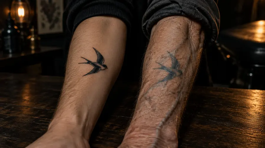
A tattoo is not a print. The needle places ink into the middle layer of the skin, the dermis, where most of the pigment particles are swallowed by immune cells and held in place. That state isn’t completely still, though: over the years some of the particles slowly migrate, cells are replaced, and the skin itself changes. The result is that every line becomes a little thicker and softer over time, and colours fade.
A commonly quoted rule of thumb says a line spreads by roughly 0.1 millimetres per decade. That sounds like nothing at first – but think about what it means over 30 years for a line that started at 0.3 mm, or for two lines running just one millimetre apart. How much ink spreads varies from person to person: skin type, placement, sun exposure, the artist’s technique and how deep the ink went all play a part. So this isn’t an exact formula, but a good starting point.
The key point: the absolute amount of spread is roughly the same on a small design and a large one. On a 20 cm back piece a few tenths of a millimetre go unnoticed; on a 2 cm wrist piece they decide whether the shape stays recognisable. So size isn’t just an aesthetic question – it’s a buffer: the bigger the design, the more room time has to work on it without ruining it.
The detail-to-size rule
Artists share an unwritten rule worth remembering: the more detail a design has, the bigger it needs to be. It isn’t really the overall size that decides, but how small its smallest detail is. A simple, bold-line heart can look good for decades at 3 cm. A bouquet of the same size, full of tiny leaves, dots and thin shading, can easily blur into a single dark patch within 10–15 years.
Why? Because detail depends on the gaps between lines. On skin, the eye reads not only the lines but also the light space between them. If that space is too narrow, it simply closes up over the years. As a rule of thumb: lines and gaps closer than 1 millimetre typically merge within 10–15 years. That’s when an “e” turns into an “o”, the sparkle in a portrait’s eye disappears, and a delicate pattern becomes a grey smudge.
This leads to a simple practical method. Look at your design and find its narrowest gap or smallest inner shape – the inside of a letter, the space between two petals, the corner of an eye in a face. If that doesn’t comfortably reach 1–1.5 millimetres at the planned size, you need either a bigger size or a simpler design.
A quick size cheat sheet by design type
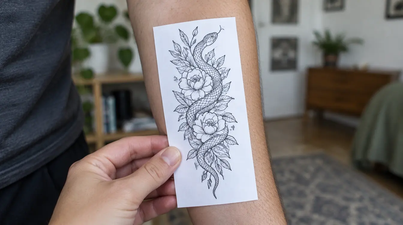
Nobody can give an exact number for a design sight unseen, but there are well-tested ranges you can start from. The numbers below refer to the design’s longest side, and are best thought of as lower limits rather than ideal sizes.
Simple symbols and bold shapes
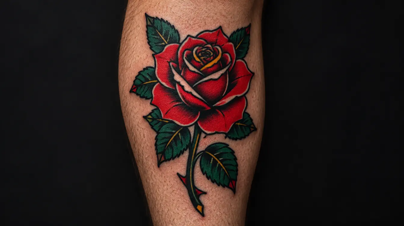
An outlined heart, star or moon, a bold-line geometric shape or a simple silhouette usually ages well even at 3–5 cm. There’s little inner detail, and the shape comes from the outer outline, which softens over time but stays readable.
Fine line designs
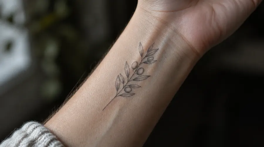
The beauty of fine line work is the thin line itself – and that’s also its weakness. A thin line holds less ink, so it fades sooner, and the gaps between details close sooner too. With a fine line design it’s worth going bigger than you’d first think and avoiding dense inner detail. Crispness often visibly softens after 5–10 years, depending on size, placement and sun.
Compositions with several elements
If your design combines several motifs – say a flower, a bird and a date – each element has to be readable on its own. Designs like this usually need 8 cm or more, and a little breathing room between the elements helps a lot.
Faces, portraits, realism
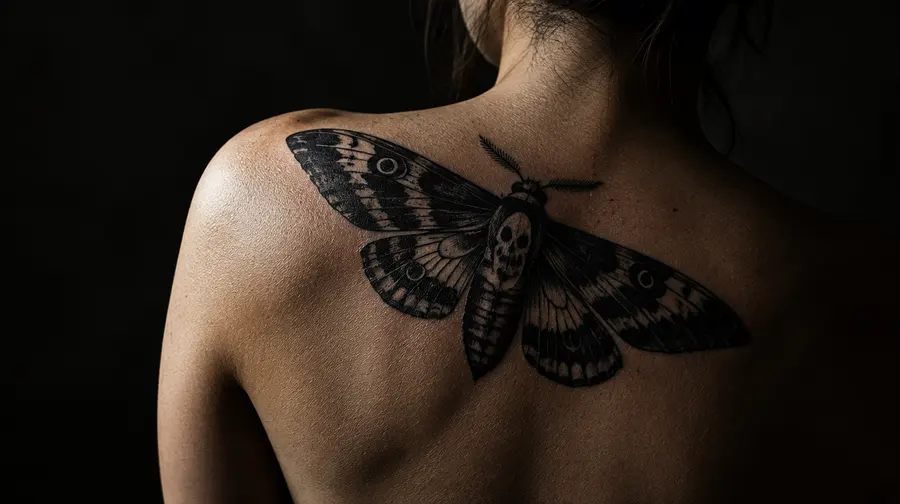
Realism is the most demanding. In a face, the subtle tonal shifts of the eyes, nose and mouth create the likeness, and those are exactly what disappear first. A portrait usually needs a much larger size than you’d expect – often palm-sized or bigger is realistic. Here your artist’s experience is the best guide.
In short, as a starting point:
- 3–5 cm: simple symbol, bold shape, silhouette
- 5–8 cm: motif with little detail, short lettering with large enough letters
- 8–12 cm: multi-element, shaded or finely detailed design
- 12–20 cm and up: realism, portraits, complex scenes
Lettering is its own genre
Lettering is one of the most popular tattoo types – and one of the ones that disappoints most often. Letters are full of tiny closed shapes: the insides of “a”, “e”, “o” and “g”, the loops of script letters. These are exactly the narrow gaps that close up over time.
As a rule of thumb, letters should be at least about 1 cm tall, and more for script, ornate or very thin typefaces. From that you can easily work out the overall size: a ten-letter word on a single line will easily be 7–10 cm long. If that seems too long for the spot you chose, go for shorter text, two lines or a different placement – not smaller letters.
The typeface matters at least as much as the size. Open, simple letterforms, wider letter spacing and lines that aren’t too thin all help longevity. Very tight calligraphy where letters run into each other is risky even at larger sizes.
- Choose open letterforms and avoid very small loops.
- Leave enough space between letters and words.
- Be especially careful with dates and numbers: the insides of 6, 8, 9 and 0 close up easily.
- If the text is long, use more lines rather than smaller letters.
Placement has a say too
The same design needs a different size on your back than on your finger. Placement affects three things: how much space there is, how much the skin curves and moves, and how much sun it gets.
Fingers, hands and wrists tend to wear and blur faster: the skin moves a lot there, gets washed often and sees plenty of sun. Simple, bolder line designs suit these spots best. The upper arm, thigh, shoulder blade and back, on the other hand, are more stable areas where a larger size fits naturally and designs usually age more slowly.
Curvature matters as well. A design wrapping around the forearm needs different proportions from one on a flat shoulder blade, and what measures 10 cm on paper can look smaller or distorted on a curved body part. It’s worth matching the design to the body’s lines: an elongated shape suits the forearm or shin, a round composition the shoulder or thigh.
When small is still a good choice
None of this means you shouldn’t get a tiny tattoo. A small piece can be beautiful, personal and long-lasting – it just has to be designed differently. The secret is that a small size calls for simplicity. A tiny tattoo ages well when:
- it has few, clearly separated elements;
- its lines aren’t too thin;
- there’s plenty of space between inner details;
- its shape is recognisable as a silhouette;
- it isn’t placed on the spot that wears the most.
If the design you’ve chosen doesn’t meet these, you have two options: make it bigger, or simplify it. A good artist can help with both – often by keeping the essence of the design and dropping a few tiny elements that would disappear within a few years anyway. It’s also worth accepting that a tiny, delicate tattoo will get softer over time. That isn’t failure, it’s natural ageing – it’s just better to know in advance.
The question isn’t how big a design you want today, but how big you’ll be glad it is in 30 years.
How to test the size before anything goes into your skin
The best decision is one based on a hands-on test. You don’t need anything special for it – just a printer, a ruler and a little patience.
- Print the design at the exact size. Check with a ruler that the print really is the size you planned – printers often rescale.
- Cut it out and hold or tape it to your skin. Exactly where the tattoo would go, following the curve of the body part.
- Look in the mirror both up close and from a distance. It should be recognisable from a metre or two – that’s where other people will see it from.
- Take a photo and look at it later. A day later, with fresh eyes, you often see it quite differently.
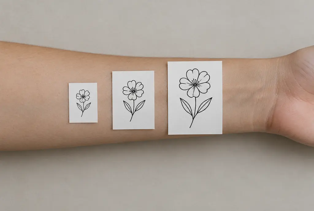
- Try a bigger and a smaller version too. Three sizes side by side often settle the question immediately.
- Wear it for a day. A temporary transfer or a skin-safe marker helps you feel whether the size and placement work in everyday life.
If you’re unsure, it’s usually worth leaning towards the bigger size. You rarely hear anyone regret that their tattoo stayed too readable – the opposite is far more common.
Talk to your artist about size
If your artist suggests a larger size, it’s usually not a sales trick but experience. They’ve seen how their own and others’ work looks after five or ten years, and they know which parts of your design will blur first. It’s worth staying open and asking for their reasoning.
A few questions you can comfortably ask at the consultation:
- What’s the smallest size at which you think this design will still age well?
- Which detail will blur first?
- What would you leave out if it had to be done smaller?
- Do you have photos of similar work that’s a few years old?
And if an artist agrees without a second thought to a very tiny, very detailed design, that tells you something too. A good professional would rather talk you out of something than make a piece that disappoints you in a few years.
How InkAge helps you choose a size
We built InkAge precisely for questions like these. When you upload your photo and place the design on it, the editor shows the size in real centimetres, so you don’t have to guess how big it will actually be. With the 3, 5, 8, 12 and 20 cm quick buttons you can switch between typical sizes with a single tap and immediately see how the design looks on that body part.
Even more importantly, you can see how the design will look fresh and after 1, 10, 30 and 50 years. The ink longevity score (0–100) takes size into account too: very small, detailed designs score lower, because they’re exactly the ones that blur first. If it looks like your design would age better at a larger size, you get a suggestion – for example “Try it at 8 cm” – and can resize it with one click.
Once you’ve found the right size, it’s included in centimetres in the PDF for your artist, so you don’t have to explain again at the consultation what you had in mind. And if you’re torn between two sizes, your friends can vote. Of course a simulation never replaces the artist’s expertise – but it’s a great starting point for thinking it through together.
The most common size mistakes
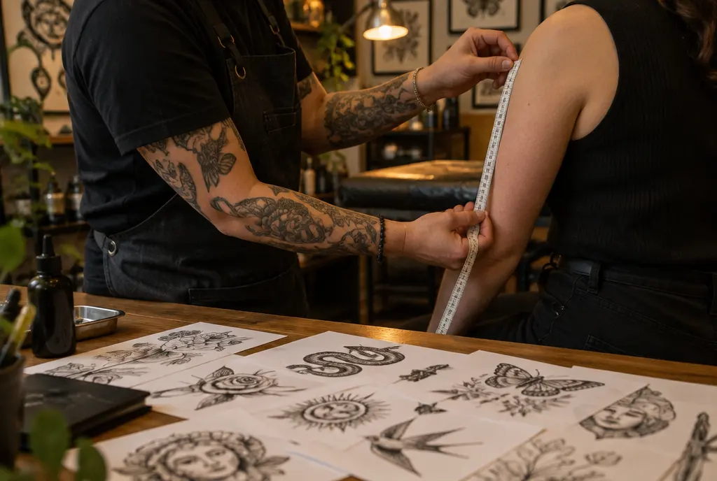
Most size-related disappointments come down to a few familiar patterns. Avoid these and you’ve already done a lot to help your tattoo age well.
- Too much detail in too little space. The most common mistake: trying to squeeze a whole scene into a matchbox-sized area.
- Being fooled by the screen. Zoomed in on a phone, everything looks sharp. Always look at the real size in centimetres.
- Lettering with tiny letters. A long quote in 4–5 mm letters can become illegible within years.
- Ignoring placement. What works on the shoulder blade doesn’t necessarily work on a finger.
- Forgetting the future. If you might extend the design later or fit it into a bigger composition, leave room and proportion for that now.
None of these mistakes is fatal, and most are easy to avoid with a little planning. The key is not to make the decision based only on how it looks today.
The one thing to take away
If you remember just one thing from this article, make it this: your design’s smallest detail sets the minimum size, not the overall picture. Find the narrowest gap, think about what will happen to it over the decades, and set the size accordingly – or simplify the design.
The right size isn’t necessarily the biggest; it’s the one at which your design stays itself today and in 30 years. Give it a little time, test it on your skin, talk to your artist – and you’ll most likely end up with a tattoo you’ll enjoy looking at decades from now as much as on the first day.
Frequently asked questions
What is the smallest size that still ages well?
It depends on the detail. A simple bold-line symbol can be 3–4 cm, a detailed design usually needs at least 8 cm, and a portrait often much more. The narrowest gap is what decides: if it’s under 1 mm at the planned size, it will probably merge.
How tall should the letters be in a lettering tattoo?
As a rule of thumb, at least about 1 cm tall, and more for script or ornate typefaces. If that makes the text too long, choose a shorter text or more lines rather than smaller letters.
Does every tiny tattoo really blur?
Every tattoo softens somewhat, but simple, bolder-line, airy small designs can stay readable for decades. It’s small designs that are also highly detailed that blur fastest.
How do I check the size in InkAge?
Place the design on your photo: the editor shows the size in centimetres and has quick buttons for 3, 5, 8, 12 and 20 cm. Check the 30- and 50-year previews and watch the ink longevity score – if a bigger size would be better, you’ll get a suggestion.
What should I do if my artist suggests bigger than I want?
Ask which detail they’re worried about and what they’d leave out if it had to be smaller. There’s often a middle ground: a simpler design at the size you want. If you’re still unsure, test both versions with a printout or in InkAge.
Written by the InkAge editorial team from widely accepted tattoo-care practice. Figures are rules of thumb, not measurements. This is general information, not medical advice — ask your artist or a dermatologist about your own skin.
Last updated: 12 October 2026