In short
- The photo you fall for is usually taken the day the tattoo was finished. The tattoo you live with is the healed one, and it keeps changing.
- At 10 years bold work looks almost the same, fine detail starts to soften and light colours pale.
- At 20–30 years lines are visibly wider and anything packed tighter than about a millimetre tends to merge.
- When you compare before-and-after photos, check the light, the angle and whether the “before” is fresh or healed. Most of the drama online comes from those three things.
In this article 8
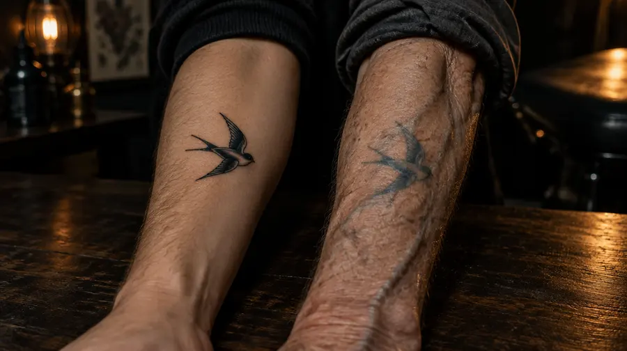
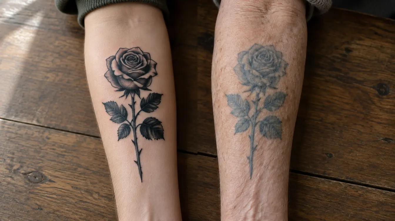
Search for “tattoo after 20 years” and you get two kinds of pictures. One kind makes you want to book an appointment tonight: a crisp black panther on a fifty-year-old shoulder, still sharp enough to cut yourself on. The other kind makes you want to cancel: a grey cloud on a forearm that, according to the caption, used to be a hummingbird.
Both are real. The question is which one yours will be, and that is far less of a lottery than those photos suggest. In this guide we follow four very common tattoos through three decades, then show you how to read the before-and-after photos you will keep running into, so you can tell a genuinely aged tattoo from a badly lit one.
The “before” is not what you think
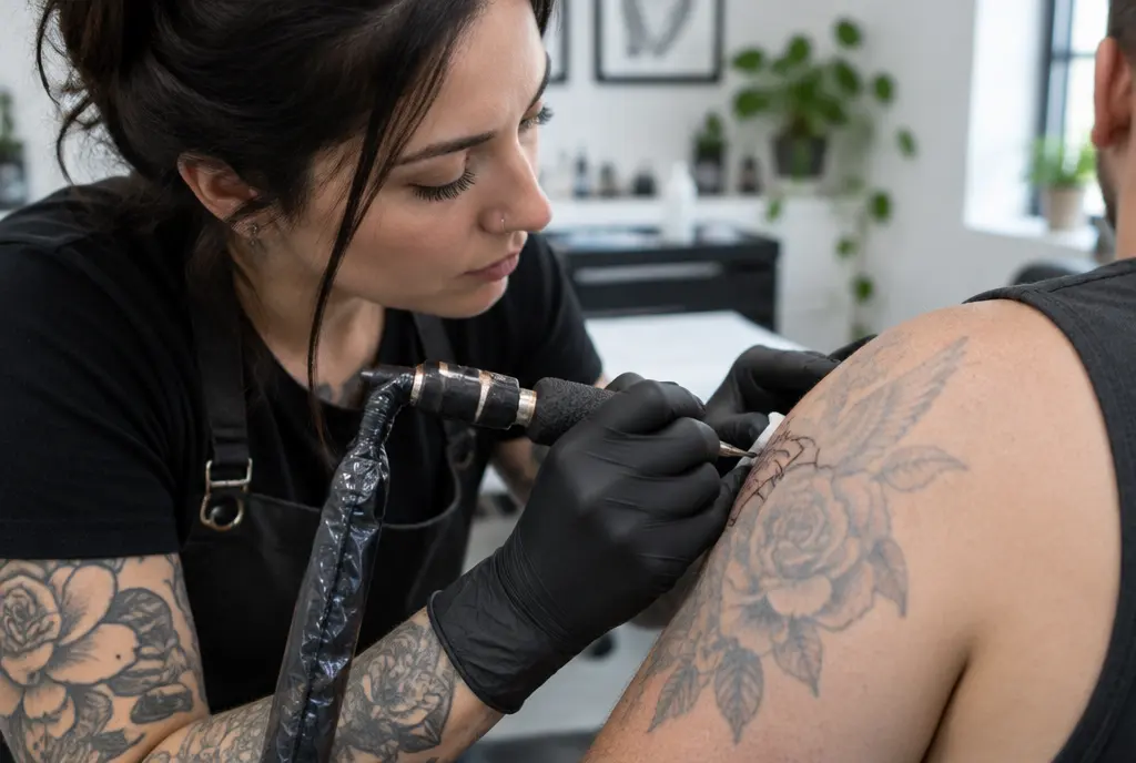
Almost every “before” photo has the same problem: it was taken minutes after the last line. Fresh tattoos are swollen, a little red and covered in a thin film of ointment that makes black look blacker and colours glow. That glossy picture is the version that goes on Instagram, and it is the version most of us carry around in our heads.
Then the skin heals. Over the following weeks the top layer renews itself, some ink near the surface leaves with it, and a thin new layer settles over the design like frosted glass. By about two months in, the tattoo is noticeably softer and a shade lighter. Nothing went wrong. This is simply the real starting point, and every later comparison should be made against it, not against the shiny day-one photo.
Four tattoos, thirty years
To make this concrete, picture four people who all get tattooed in the same week. None of them are reckless, none of them are obsessive about aftercare. They live ordinary lives, get some sun in summer and forget the sunscreen more often than they’d admit.
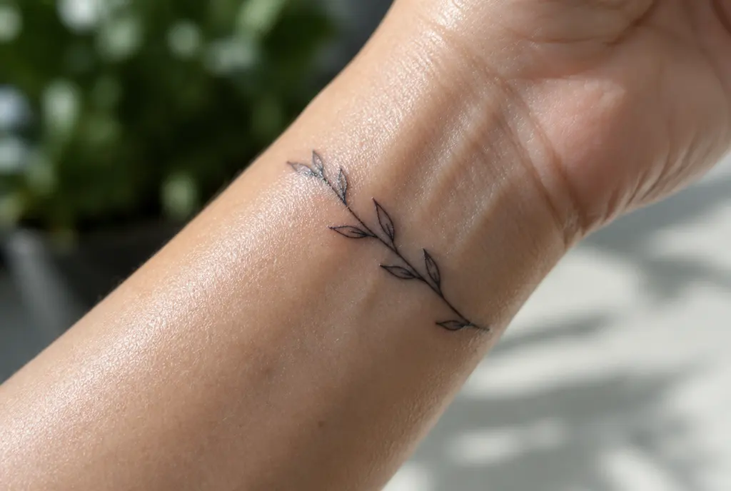
Anna: a fine line word on her inner wrist
Anna gets her daughter’s name in delicate script, about three centimetres long, the letters barely two millimetres tall. On day one it is perfect, the kind of tattoo that gets a hundred saves.
At 10 years the outer shape of the word is intact, but the little holes inside the “e” and the “a” have started to close. From across a table people can still read it. Up close, the lines look slightly fuzzy, as if drawn with a pen on paper that was a touch too soft.
At 20 years the loops have filled in. The word reads as a word mostly because Anna knows what it says. Her wrist also bends hundreds of times a day and gets washed constantly, which hasn’t helped.
At 30 years it is a soft dark line with a recognisable rhythm. Still pretty, still hers, but no longer script in the way it was. A slightly bigger version, maybe five centimetres with a bit more space between letters, would have read clearly for decades longer.
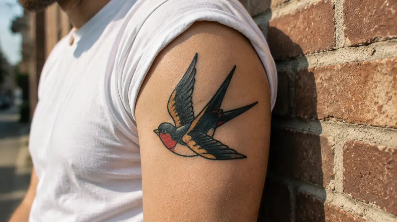
Ben: a traditional swallow on his upper arm
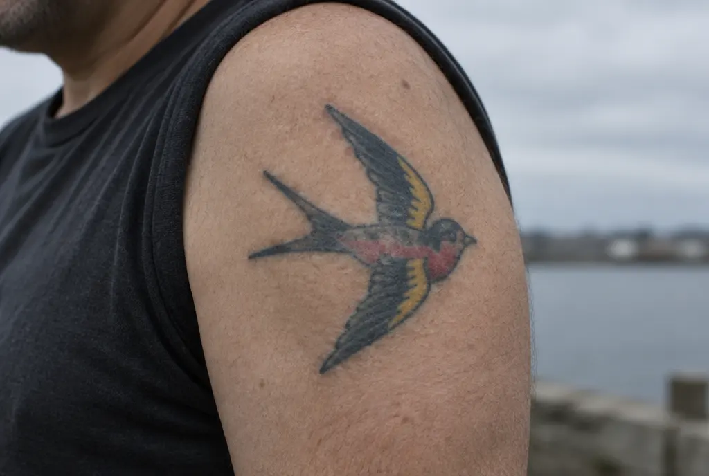
Ben goes for an old-school swallow: thick black outline, solid red and yellow, about the size of his palm. On day one it looks almost cartoonishly bold.
At 10 years it looks very nearly the same. The yellow has dropped a step and the red is a little less loud, but the outline is doing exactly what it was designed to do.
At 20 years the yellow is closer to cream, the edges of the outline have softened by a hair, and the whole thing has the gentle patina people associate with “real” traditional tattoos.
At 30 years it is still clearly a swallow from across a beach. This is not luck. The style was developed by tattooers who expected their work to be seen on sailors decades later, and it shows.
Clara: a colourful watercolour flower on her shoulder blade
Clara chooses a loose, painterly flower with no black outline, all soft washes of pink, violet and a touch of turquoise. It is beautiful, and her artist does it well.
At 10 years the softest pinks have mostly gone. The violet and turquoise are still there, but the edges that defined the petals have blurred, and the flower looks more like an impression of a flower.
At 20 years it is a pleasant patch of colour in roughly the shape of a bloom. Clara still likes it, though she has started asking about a light black linework “frame” to bring the shape back. Plenty of artists now add a fine dark outline to watercolour pieces from the start for exactly this reason.
Dávid: a blackwork mandala on his forearm
Dávid gets a big geometric mandala: solid black areas, bold lines, some fine dotwork shading in between. It covers most of his outer forearm, which, as a cyclist, sees a lot of sun.
At 10 years the solid blacks and main lines are strong, but the dotwork has started to turn into a flat grey. The sun has done more than time: the side that faces up on his handlebars is noticeably lighter than the underside.
At 30 years the structure of the mandala holds beautifully. The delicate shading between the lines is mostly gone, replaced by a soft grey glow. It still looks intentional, which is the best outcome you can ask for from fine shading on a sunny spot.
Bold things age like stone. Fine things age like pencil.
What the three milestones usually look like
Skin is personal and every tattoo is different, but when you put enough healed work side by side, a pattern appears that most artists will recognise.
Around 10 years
Bold lines and solid black look almost new. Fine lines have softened and very small text may have started to close up. Pale colours, especially yellow, white and pastels, are clearly lighter. A tattoo that gets regular sun can look a few years older than its age. This is when many people get their first touch-up.
Around 20 years
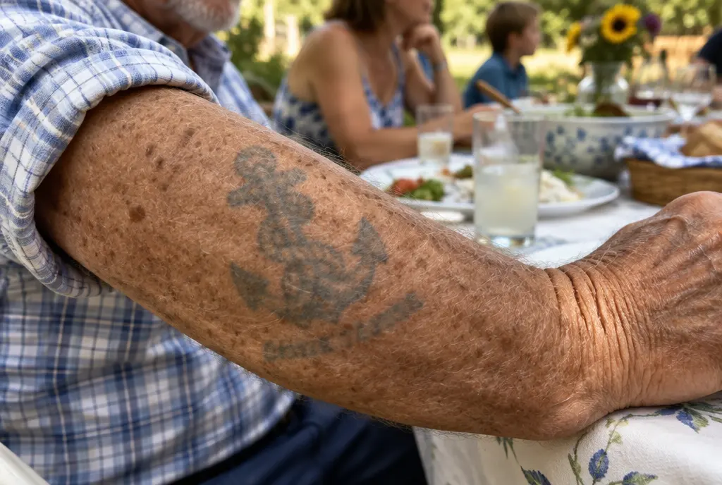
Lines are visibly wider, roughly in line with the artists’ rule of thumb of about a tenth of a millimetre of spread per decade. Gaps smaller than about a millimetre are often gone. Skin has started to change too, so tattoos on the hands, neck and other thin-skinned areas look looser. Colour pieces with a strong outline still read well; outline-free ones depend heavily on how saturated they were to begin with.
Around 30 years
The tattoo now speaks through its overall shape. Silhouettes, big contrasts and solid areas carry the image. Small details have usually merged into tone. On well-planned work this looks like a mellowed, lived-in version of the original. On tiny, dense work it can look like a smudge.
How to read before-and-after photos online
Once you know what normal ageing looks like, a lot of the scary photos on the internet start to look different. Before you let a stranger’s forearm decide your next tattoo, check a few things.
- Is the “before” fresh or healed? A shiny, red-edged day-one photo next to a matte ten-year-old one exaggerates every change. Compare healed with healed.
- Is the light the same? Warm indoor light flattens contrast, harsh sunlight blows it out, and a phone flash can make black look grey. Many “faded” tattoos are simply photographed badly.
- Is it the same angle and the same size in the frame? A close-up will always look blurrier than a photo taken from a metre away. That is how eyes and cameras work, not how ink works.
- Was it filtered or edited? Smoothing filters erase skin texture and make old tattoos look worse by contrast, or make fresh ones look unreal.
- Where on the body is it, and did it get sun? A hand tattoo after ten years and an upper-arm tattoo after ten years are not the same experiment.
The honest before-and-after photo is a bit boring: same light, same angle, healed both times. Those are the ones worth learning from, and good artists usually have a few on hand.
What you can actually control
Looking at all of this, the difference between Anna’s wrist and Ben’s swallow isn’t talent or luck. It is a handful of decisions, most of them made before the needle touches skin.
- Size for the detail you want. If the design has text or fine elements, give them room. A few extra centimetres buy decades of legibility.
- Space between lines. Aim for at least a millimetre or two between neighbouring lines, more for anything you want to read at 30 years.
- A strong outline, especially for colour. The outline is the skeleton that holds the shape when the fill softens.
- Placement. Inner arm, upper arm, shoulder, back and thigh age gently. Hands, fingers, feet and the outer forearm wear faster.
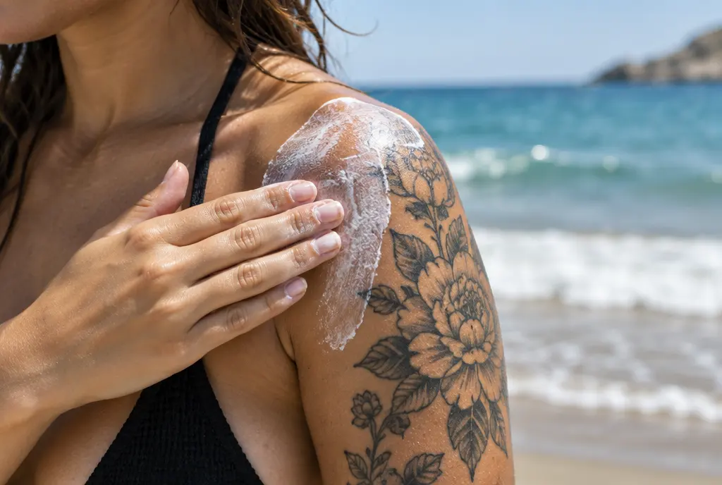
- Sun. Cover it while it heals, then use a broad-spectrum SPF 50 whenever it’s out. This one habit is the cheapest anti-ageing treatment your tattoo will ever get.
- A touch-up when it needs one. Many pieces benefit from a refresh every 8 to 10 years, and it is normal, not a sign of failure.
See your own before and after
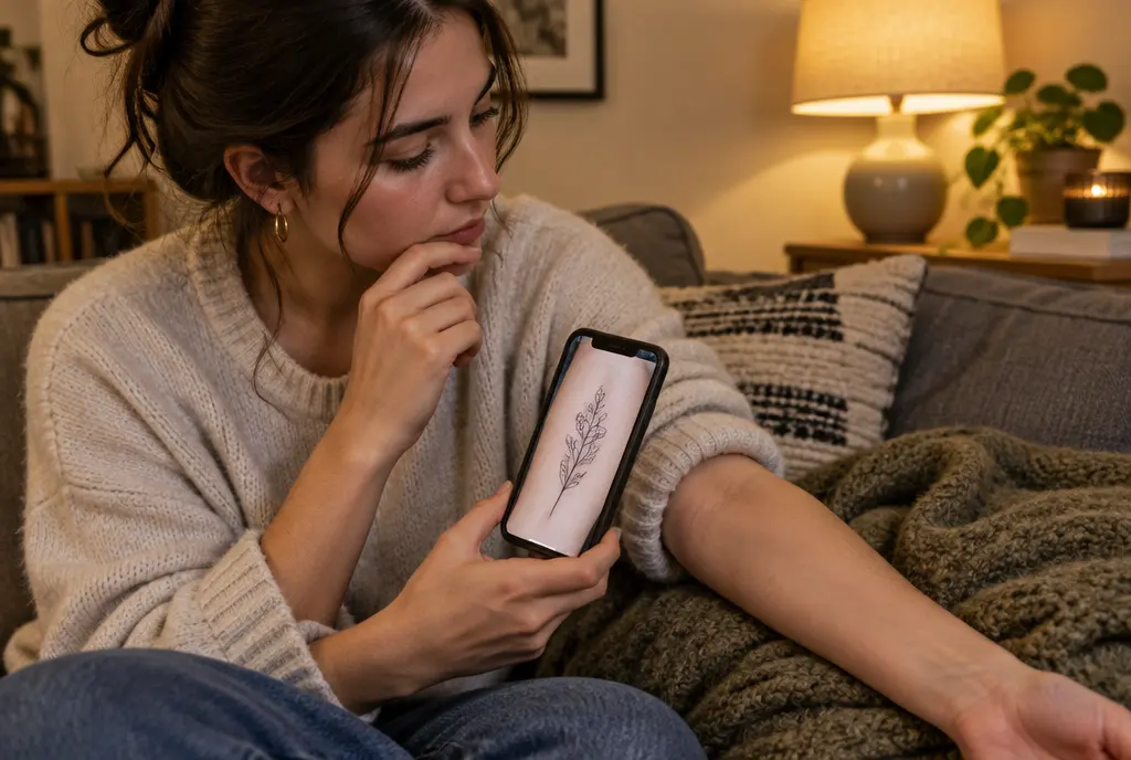
Reading about other people’s tattoos only gets you so far. What you really want to know is how your design will look on your skin, at your size, in your spot. That is what InkAge is for.
Upload a photo of the place you have in mind, add your design and adjust its size the way you would in the studio. You will see it fresh, healed, and as it is likely to look after 10, 30 and 50 years, with a longevity score that tells you how well that size and placement suit the design. If a detail disappears in the 30-year image, you can make the design bigger, give it more space, or try the “Make it last” version before you book.
It is an estimate, not a crystal ball: your skin, your artist and your life all play a part. But it lets you have the conversation Anna never had, before the ink goes in rather than twenty years after.
The short version
Every tattoo has a before and an after. The trick is to judge the design by its after. Fresh photos show you how a tattoo looks on its best day; healed, ten-year-old photos show you how it will look on an ordinary Tuesday for most of your life. Design for the Tuesday.
Frequently asked questions
How much does a tattoo change in the first year?
Most of the visible change happens in the first two months, while it heals: the design becomes a little softer and lighter as the top layer of skin renews. After that, the first year changes very little. The healed tattoo is your true starting point.
What does a tattoo look like after 10 years?
Bold lines and solid black usually look almost new. Fine lines are softer, very small text may start to close up, and light colours such as yellow and white are noticeably paler, especially if the tattoo gets regular sun.
Which tattoos look best after 30 years?
Designs with a clear silhouette, bold lines, strong contrast and enough space between details: traditional, bold blackwork and larger illustrative pieces. Tiny, dense designs and outline-free colour tend to change the most.
Why do some before-and-after photos look so dramatic?
Usually because the “before” is a glossy day-one photo, the light or angle is different, or a filter has been used. Compare healed with healed, in similar light, from a similar distance, and most of the drama disappears.
Can I see how my own tattoo will age before I get it?
Yes. In InkAge you upload a photo of the spot and your design, and see it fresh, healed and at 10, 30 and 50 years, with a longevity score. It is an estimate, but it shows clearly when a detail is too small for the size you chose.
Written by the InkAge editorial team from widely accepted tattoo-care practice. Figures are rules of thumb, not measurements. This is general information, not medical advice — ask your artist or a dermatologist about your own skin.
Last updated: 23 October 2026