In short
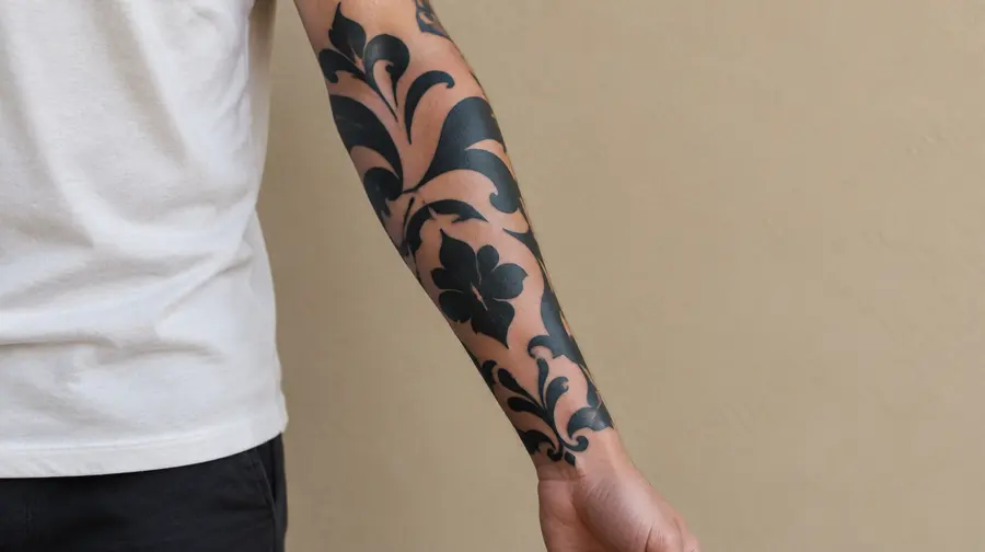
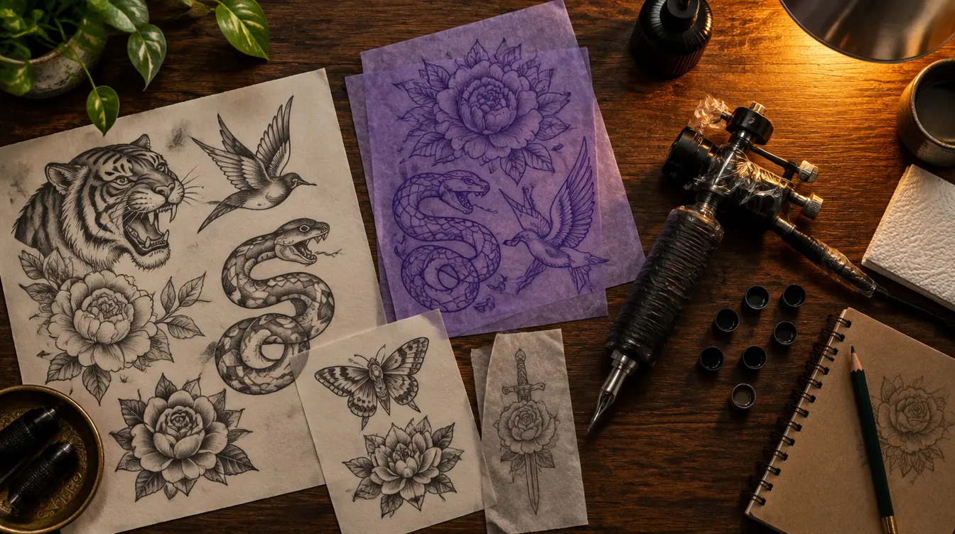
- Bold styles with solid black and clear shapes, such as American traditional, tribal, blackwork and Japanese work, usually age best.
- Detailed styles like realism, neo-traditional, dotwork and geometric work age well when they are big enough and have strong contrast.
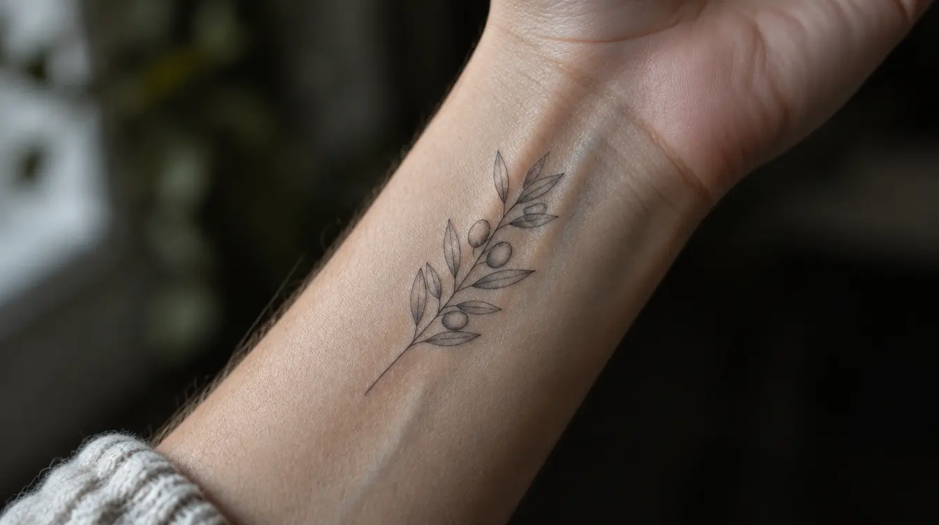
- Fine line, micro tattoos, small script and watercolour without an outline change the most, especially on hands, fingers and feet.
- Choose by looking at healed work, giving detail enough room, matching the style to the placement and picking an artist who specialises in it.
In this article 9
Nora had 63 saved pictures in a folder called “maybe”. A red rose with a thick black outline. A tiny fine line moon. A watercolour fox with no outline at all. A Japanese koi swimming up a forearm. A geometric wolf. She liked them all, which was exactly the problem. When she finally showed the folder to a tattoo artist, he scrolled for a while and asked one question she had never thought about: “Which of these do you still want to recognise when you are sixty?”
That question is what this guide is about. There are dozens of tattoo styles, and most style guides only tell you what each one looks like. That is useful, but it is half the story. Every style is also a set of technical choices: how thick the lines are, how much black there is, how much bare skin is left between the details. Those choices decide how the tattoo looks in ten, twenty and thirty years.
> A note on the pictures: the images in this article are illustrations made to show typical tendencies. They are not photos of real tattoos or real people.
The short answer
Styles built on bold outlines, solid black and clear shapes, such as American traditional, tribal and heavy blackwork, usually age best. Styles that rely on very thin lines, tiny details, soft colour without an outline or white ink tend to change the most. Neo-traditional, Japanese, realism, script, dotwork and geometric work sit in between: they can age very well when they are big enough and have enough contrast, and blur sooner when they are not.
No style is a guarantee in either direction. A skilled artist can make a fine line piece last, and a badly done traditional tattoo can blow out within a year. But the style sets the starting odds.
Read alsoHow tattoos age: what really happens to ink over 50 yearsWhat decides how any style ages
All tattoos change for the same reasons. The ink sits in the dermis, the layer under the surface of the skin. Over the years a small part of it drifts outwards and some is slowly cleared away by the body. Sun breaks pigment down, and skin loses firmness with age. The result is that lines get a little wider and softer, colours get paler and contrast drops. Artists often estimate the spread at roughly a tenth of a millimetre per decade.
Whether that matters depends on three things that every style handles differently:
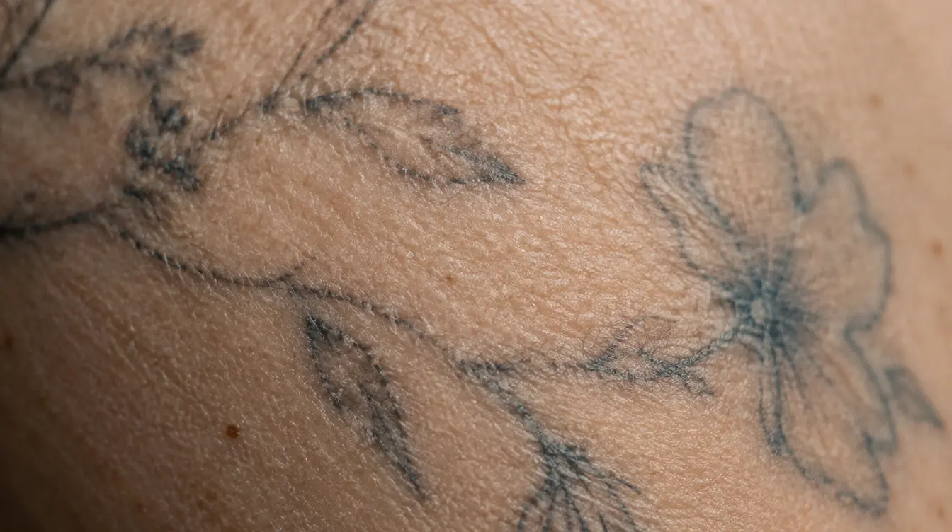
- Line weight. A tenth of a millimetre is nothing on a bold line. On a hairline it is a large share of its width.
- Contrast. Dark next to bare skin stays readable when everything softens. Pale next to pale turns into one tone.
- Size and spacing. Details need room. If two lines are closer than about one to two millimetres, they tend to merge sooner or later.
A style is not only a look. It is a decision about how much room the ink has to age.
Bold styles: built to last
American traditional
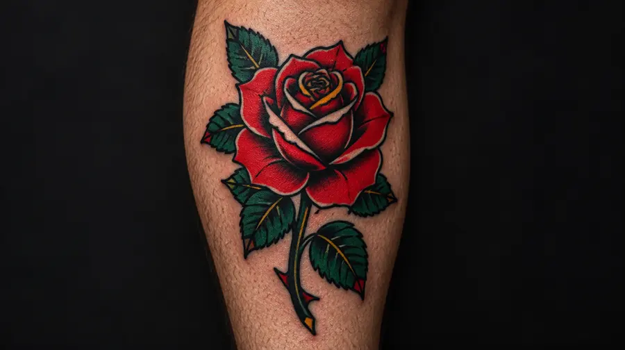
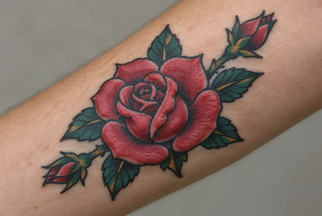
What it looks like: thick black outlines, a small palette of solid colours (usually red, green, yellow and black), simple shading and iconic images such as roses, swallows, daggers, panthers, ships and hearts with banners. The style took shape in the first half of the twentieth century around sailors and port towns, and Norman “Sailor Jerry” Collins in Honolulu is its best-known name.
Who it suits: people who like a classic, graphic look and want a tattoo that reads from across a room. It works on almost every placement and on all skin tones, because it relies on black and contrast more than on delicate colour.
How it ages: this is the style the saying “bold will hold” comes from. After ten years a well-made piece usually looks almost the same, with slightly softer colour. After twenty to thirty years the colours are paler and the lines a bit wider, but the image is still clearly a rose or a swallow. Yellow and the lighter colours fade first; the black skeleton stays.
Neo-traditional
What it looks like: the bold outlines of traditional, with a richer palette, more depth, varied line weights and decorative detail such as jewels, ornaments and flowers. Women’s portraits and animal heads framed with ornaments are typical.
Who it suits: people who love the solidity of traditional but want something more detailed and illustrative. It needs some size: a forearm, calf, thigh or upper arm rather than a wrist.
How it ages: very well, as long as the detail is kept to a sensible density. The outlines hold the image together for decades. The parts that soften are the fine inner details and the light colour gradients, so a neo-traditional piece at thirty years looks a little simpler than on day one.
Tribal
What it looks like: large shapes of solid black with sharp, flowing edges. The word tattoo itself comes from the Polynesian “tatau”, and Polynesian, Māori, Samoan and Bornean traditions each have their own patterns and meanings. The tribal style of the 1990s borrowed the bold black shapes, mostly without the meaning.
Who it suits: people who want maximum boldness. If you are drawn to a specific cultural tradition, look for an artist who works in it and respects what the patterns mean.
How it ages: among the best of any style. Solid black on bare skin keeps its contrast for decades. Edges soften slightly and the black can turn a little grey or bluish in sun-exposed spots, but the shapes stay readable.
Blackwork
What it looks like: designs made mostly or entirely of black ink, often with large filled areas: ornamental patterns, bold illustrations, heavy botanicals, even full blackout sleeves. Blackwork is less a single style than a family that overlaps with tribal, dotwork and geometric work.
Who it suits: people who want a strong, graphic look, people with darker skin who want maximum contrast, and people planning a cover-up, because solid black hides a lot.
How it ages: black is the most stable ink there is, and bold blackwork often looks nearly unchanged after decades. The weak spots are thin strips of bare skin left inside large black areas: they slowly narrow as the black around them spreads, so negative space needs to be generous.
Detailed styles: they need size
Realism (black and grey or colour)
What it looks like: portraits, animals, landscapes and objects that look like photographs, built from smooth shading rather than outlines. Black and grey realism uses diluted black ink in many shades; colour realism uses a full palette.
Who it suits: people who want a specific image, such as a pet or a loved one, and are willing to give it a large area such as a forearm, calf, thigh or back. Realism needs a specialist: the gap between a good and a bad realistic tattoo is wider than in any other style.
How it ages: it depends almost entirely on size and contrast. A large piece with deep blacks and clear highlights can still look good after twenty to thirty years, although the subtle mid-tones flatten and fine details such as eyelashes or fur blur. A realistic portrait the size of a coin loses its features much faster. Pale greys and soft colour shading go first, which is why many artists push the contrast a little harder than looks natural on day one.
Japanese (irezumi)
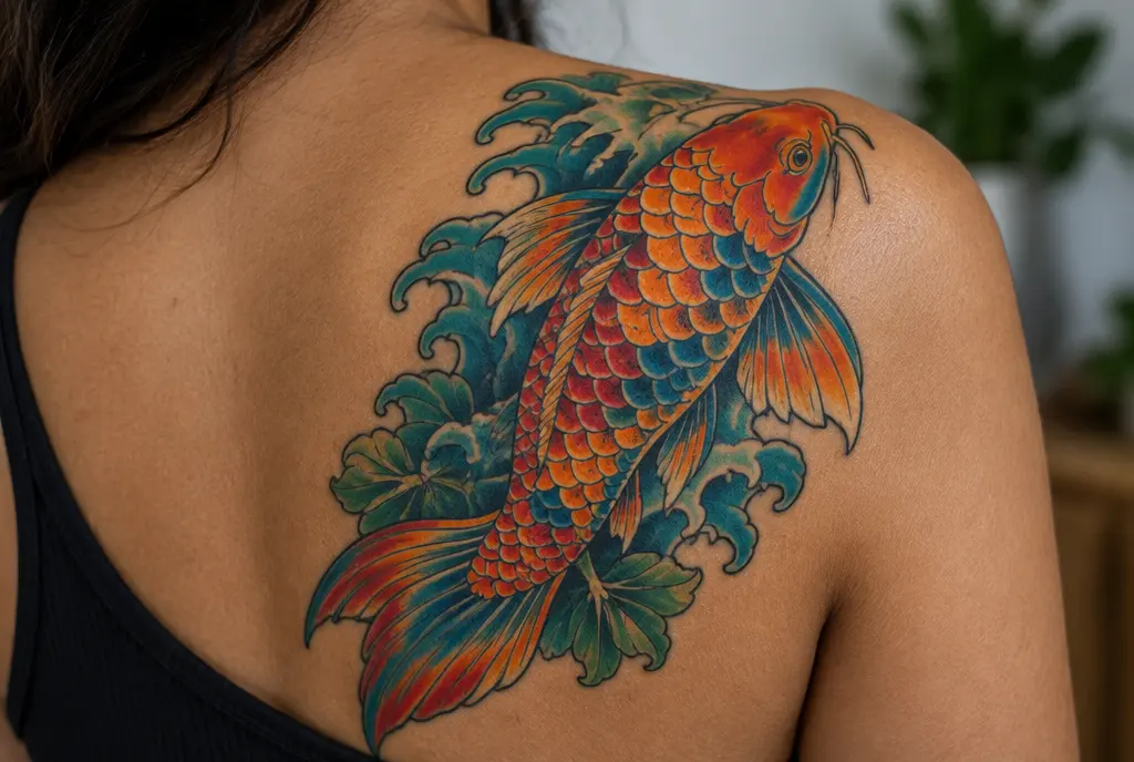
What it looks like: large, flowing compositions with koi, dragons, tigers, peonies, cherry blossoms and waves, set against backgrounds of wind, water or clouds. Traditional pieces are planned to fit the body as a whole: a sleeve, a backpiece or a full bodysuit, which can take anywhere from one to five years of regular sessions.
Who it suits: people who want one large, coherent piece rather than many small ones, and who are ready for a long project. It is one of the most demanding styles to wear and to sit for.
How it ages: very well. Japanese work combines bold outlines, strong black backgrounds and large, readable shapes. Colours soften over decades and the background shading can merge a little, but a good Japanese sleeve is still unmistakable at thirty years.
Delicate styles: beautiful, but they change
Fine line
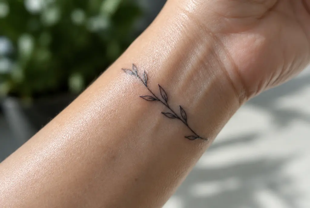
What it looks like: thin lines made with one or very few needles, delicate botanicals, small portraits and minimal shading. Fine line has been one of the most requested styles of the last decade, partly because it looks soft and elegant in photos.
Who it suits: people who want something subtle and discreet, and anyone happy to plan a touch-up every few years.
How it ages: this is the style where the starting odds are lowest. Thin lines have little room for spread, so after ten years they can look softer or slightly broken, and after twenty to thirty years small fine line pieces can be blurry or faint. Larger, airy fine line work with generous spacing lasts much better than tiny, dense pieces. Placement matters a lot: hands, fingers and feet are the hardest.
Minimalist and micro tattoos
What it looks like: small, simple symbols such as a heart, a wave, a date, an initial or the outline of a mountain, often only a few centimetres across.
Who it suits: first-timers, people who need a tattoo that is easy to hide, and people who want a meaningful symbol rather than a large piece of art.
How it ages: simple shapes age well; tiny detailed ones do not. A small solid heart can look fine at thirty years. A coin-sized design with letters, a face or several elements inside it often blurs within a handful of years. A useful rule: if a design already looks crowded at the size you plan, make it bigger or simpler.
Script and lettering
What it looks like: names, dates, quotes and words in anything from heavy blackletter to elegant handwriting or typewriter fonts.
Who it suits: almost everyone, but it is the style where size mistakes show most, because unreadable text is obvious.
How it ages: lettering lasts for life when the letters are tall enough and the spaces inside them, in letters like “e”, “a” and “o”, stay open. Small, thin, tightly spaced script is one of the most common tattoos to become hard to read over time. Many artists suggest letters of at least about one centimetre for thin fonts, more for long words.
Dotwork
What it looks like: images and shading built from thousands of dots instead of lines or smooth gradients. It is common in mandalas, sacred geometry and ornamental work.
Who it suits: people who like a textured, handmade look and patterns more than pictures.
How it ages: the dots slowly spread, so fine stippling tends to merge into a smoother grey over the years. That is not always bad, because well-planned dotwork turns into soft shading. It looks intentional for decades as long as the main structure is bold; very light, sparse dotwork can fade into the skin.
Geometric
What it looks like: clean shapes, straight lines, symmetry, circles, triangles and patterns, sometimes combined with animals or flowers.
Who it suits: people who like precision and modern graphic design. Geometric work needs a very steady, experienced artist and a placement where the skin does not stretch or twist much.
How it ages: bold geometric work with thick lines and filled areas ages well. Fine patterns with many thin parallel lines are more fragile: lines that sit close together can merge, and small unevenness becomes easier to see as the lines soften. Changes in the skin also show more on perfect circles and straight lines than on organic shapes.
Watercolour
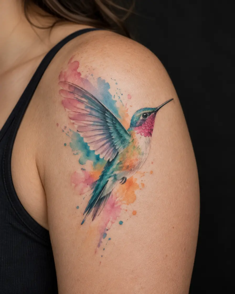
What it looks like: soft washes and splashes of colour that imitate paint, often without any black outline, sometimes with a few fine black lines.
Who it suits: people who love colour and a painterly look, and who accept that it will soften.
How it ages: the style is still fairly young, so there is little thirty-year evidence yet. What artists see is that light colours without a dark structure tend to fade sooner and their edges drift. In the first years a good watercolour piece usually looks fine; later it can become a pale impression of the original. A thin dark outline or a few darker accents make a big difference to how long it stays readable.
How each style ages, side by side
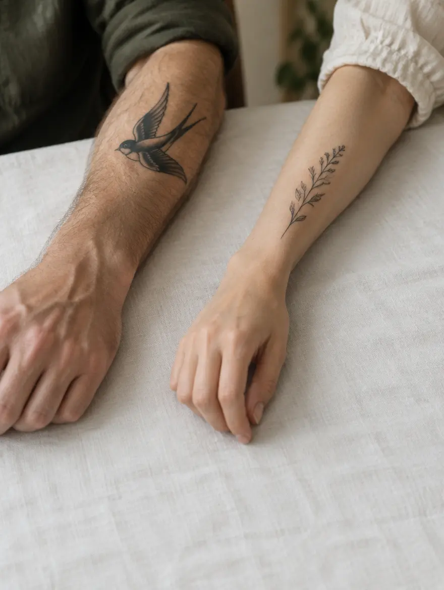
Put together, the styles fall roughly into three groups. These are tendencies, not promises: placement, sun, skin, size and the artist matter at least as much as the style.
- Usually ages best: American traditional, tribal, bold blackwork and Japanese work.
- Ages well when big and high-contrast: neo-traditional, black and grey realism, bold script, geometric work with strong lines and dotwork with a bold structure.
- Changes the most: small fine line, micro tattoos with detail, small thin script, watercolour without an outline, colour realism in pale tones and white ink.
How to choose a style you will still like
Liking a style today is the starting point. These questions help you check whether it will still work for you later:
- Look at healed work, not fresh photos. Ask the artist for pictures of tattoos that are two, five or ten years old. A fresh tattoo looks sharper than it ever will again.
- Match the style to the placement. Delicate styles do better on the upper arm, thigh or back than on hands, fingers or feet, where the skin is thin and constantly rubbed.
- Give detail room. If you love a detailed style, go bigger rather than smaller. The same design at twice the size ages far better.
- Pick a specialist. Most good artists focus on one or two styles. Fine line and Japanese work are almost different crafts.
- Plan for care. Sun protection slows fading in every style, and a touch-up after a few years can bring delicate work back.
- Mixing is fine. Many great tattoos combine styles, such as a fine line flower with bold leaves or a realistic portrait in a neo-traditional frame. The bold parts carry the design as it ages.
What it means for you
There is no best tattoo style, only the style that fits your taste, your body and the way you want the tattoo to look in the long run. Bold styles give you a tattoo that changes slowly. Delicate styles give you something softer that you may need to refresh. Both are good choices if you make them knowingly.
Nora, in the end, kept the koi and the rose and let the tiny moon go. If you are choosing between styles, it helps to see them aged rather than fresh. In InkAge you can place a design on a photo of your own skin and see how it may look after 10, 30 and 50 years. It is an estimate, not a promise, but it makes the difference between styles easy to see.
Traditional: every body area
Frequently asked questions
Which tattoo style ages best?
Styles built on bold black outlines, solid black and simple shapes: American traditional, tribal, heavy blackwork and Japanese work. They change slowly because a little ink spread barely affects thick lines and strong contrast.
Do fine line tattoos fade faster?
They tend to soften sooner, because thin lines have little room for the slow spread of ink. Larger fine line pieces with generous spacing, placed away from the hands and feet, last much longer, and a touch-up can refresh them.
What is the difference between traditional and neo-traditional tattoos?
Both use bold outlines. Traditional keeps to a small palette, simple shading and classic motifs; neo-traditional adds more colours, depth, varied line weights and decorative detail, so it usually needs a little more space.
Is watercolour a bad idea for a tattoo?
Not if you know what to expect. Light colours without an outline tend to fade and drift sooner than outlined work. A thin dark outline or darker accents help it stay readable, and sun protection makes a big difference.
What tattoo style is best for a first tattoo?
Any style you love, done at a sensible size by an artist who specialises in it. If you want something low-maintenance, a simple design with clear lines and some black is the easiest to live with.
Sources
- Irezumi: the Japanese tattoo unveiled – Nippon.com
- Electrical tattooing set (Samuel O'Reilly's 1891 electric tattoo machine) – Smithsonian American Art Museum
- Unveiling skin macrophage dynamics explains both tattoo persistence and strenuous removal – Journal of Experimental Medicine (PMC)
- How to protect tattoos from sun exposure – MD Anderson Cancer Center
- Caring for tattooed skin – American Academy of Dermatology
Written by the InkAge editorial team from widely accepted tattoo-care practice. Figures are rules of thumb, not measurements. This is general information, not medical advice — ask your artist or a dermatologist about your own skin.
Last updated: 8 November 2026