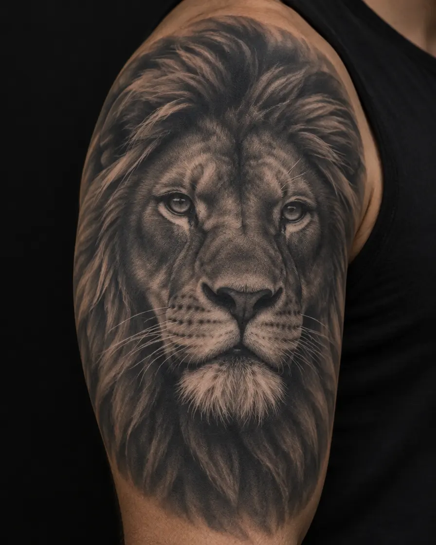
In short
- Realism is built from soft shading instead of lines, so it has less margin than bold styles. As ink slowly spreads and the sun fades the mid-tones, low-contrast work turns muddy first.
- Strong contrast is what survives: deep blacks next to clean highlights of bare skin. Black-and-grey realism usually holds longer than colour realism, where pale tones fade first.
- Size matters more than in almost any other style. Many realism artists want a face at least around 10–12 cm tall; smaller portraits lose their features within years.
- The outer forearm, upper arm and calf are the classic placements. Protect them from the sun, expect a touch-up somewhere between 5 and 15 years, and choose an artist by healed work, not fresh photos.
In this article 11
Marco waited two years before he got his grandmother’s portrait. He had the photo, the one from her sixtieth birthday where she is laughing at something just outside the frame. He had the spot, the outside of his left forearm, where he would see it every time he reached for something. And he had a question he couldn’t quite shake: would she still look like herself in twenty years, or would she slowly turn into a grey shape that only he could recognise?
It is the right question to ask. Realism is the style that looks most impressive on the day it is finished, and it is also the style that depends most on how it is planned. In this guide we look at why realism ages the way it does, what contrast and size have to do with it, which placements suit it best, and how to find an artist whose work will still look like a face, an animal or a flower long after the photos are taken.
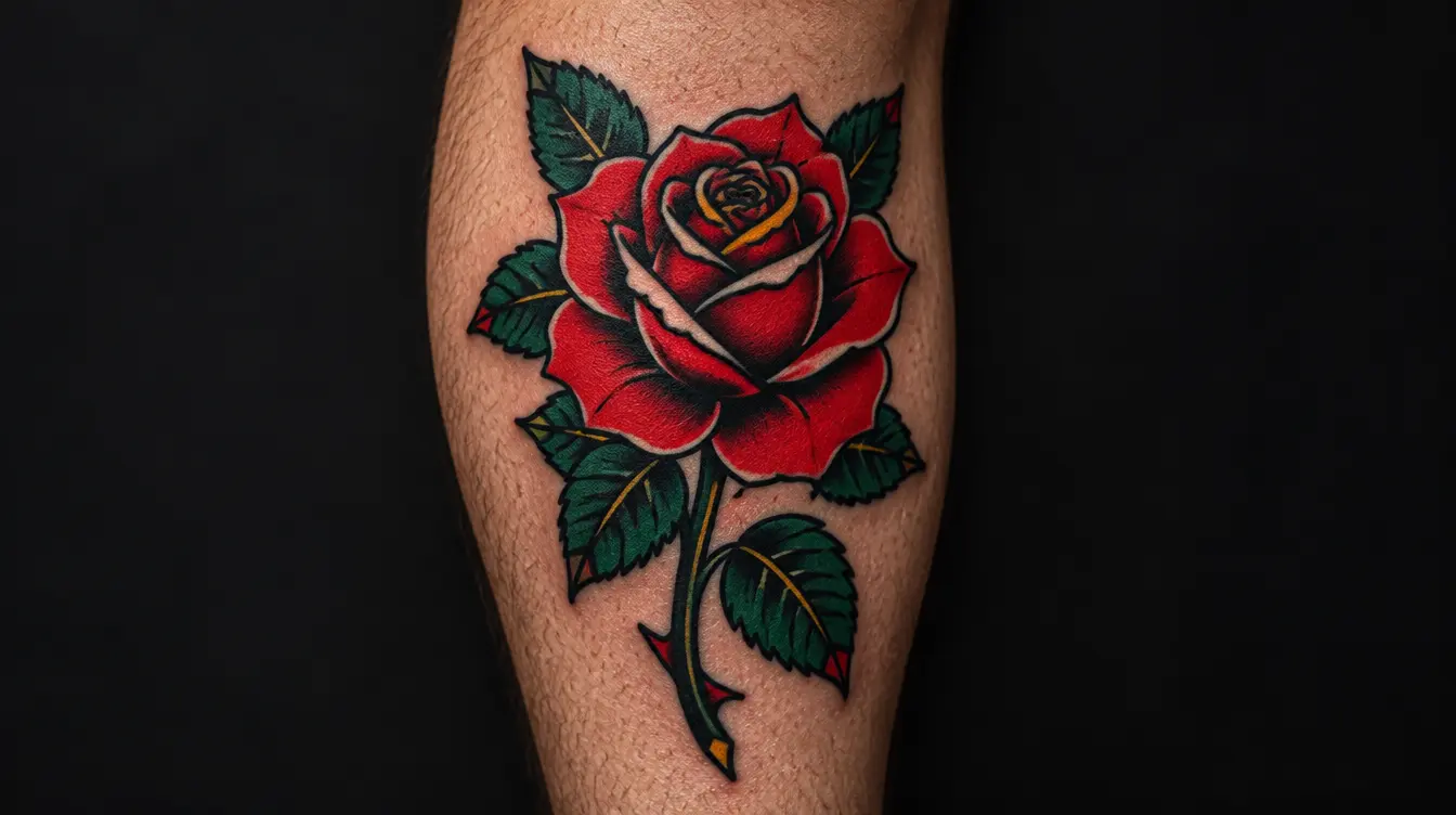
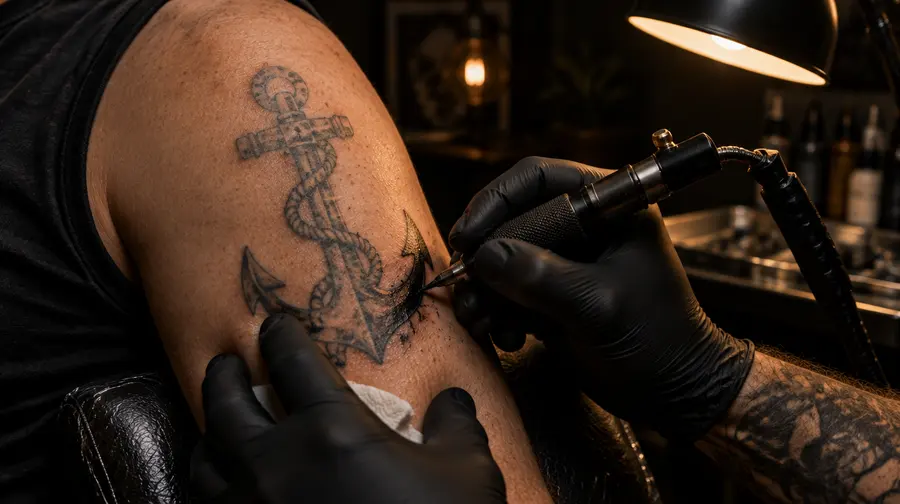
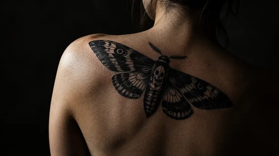
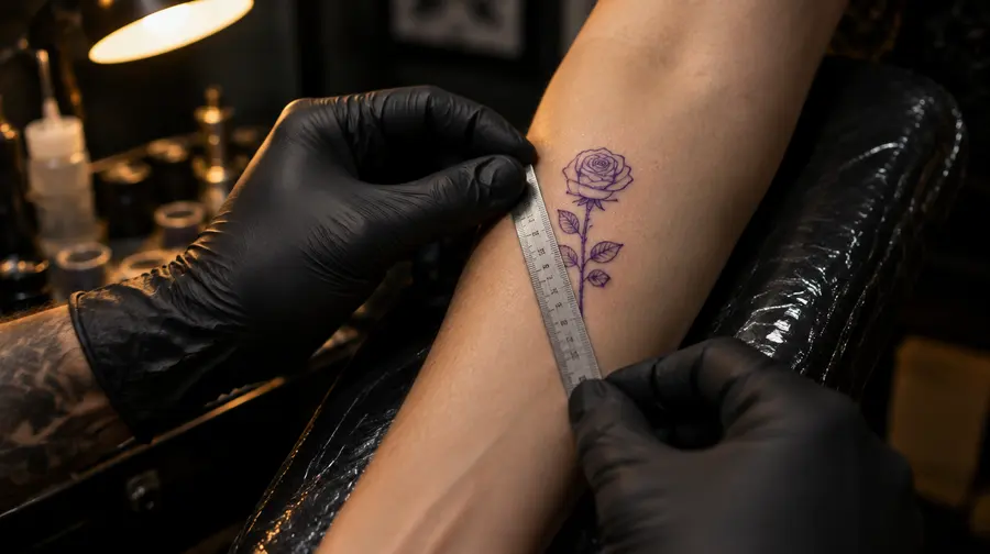
> A note on the pictures: the images in this article are illustrations made to show typical effects. They are not photos of real tattoos or clients.
What makes realism different
Most tattoo styles are built on lines. Traditional work has a heavy outline, blackwork has bold shapes, even fine line is, by definition, line. Realism mostly isn’t. It builds an image the way a photograph does: through smooth transitions from deep shadow to light, soft edges and tiny changes in tone. A cheekbone in a realistic portrait is not drawn; it appears because one grey sits next to a slightly lighter grey.
Realism comes in two main families. Black-and-grey realism uses black ink diluted into a range of greys, and lets bare skin act as the brightest highlight. Colour realism adds full colour, often with many layered shades, and can look almost like a painted photograph. Within both, portraits of people and pets are the most demanding subject, followed by animals, flowers, eyes, statues and landscapes.
That way of building an image is exactly what makes realism breathtaking when it is fresh, and exactly what makes it more sensitive to time than a design held together by a black outline.
Read alsoHow tattoos age: what really happens to ink over 50 yearsWhy realism softens with time
Every tattoo changes slowly, whatever the style. Ink particles sit in the dermis, and over the years some of them drift a little and some are carried away by the immune system. Artists often use a rule of thumb of roughly a tenth of a millimetre of spread per decade. On a bold line that barely matters. On a soft gradient it gradually blends neighbouring tones together.
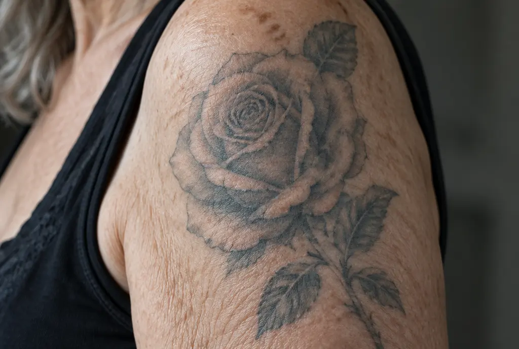
The second force is the sun. UV light breaks down pigment, and it hits the lightest, most diluted tones first. In realism those light greys and pale colours are not decoration; they are the half of the picture that creates shape and depth. When they fade, the darks stay and the midtones flatten, so a face can lose its roundness long before it loses its outline.
Realism doesn’t fade evenly. It loses the middle first, so the light and the dark have to be strong enough to carry it alone.
This is why two realism tattoos of the same age can look completely different. One still reads clearly from across a room; the other has turned into what people describe online as a “grey smudge”. The difference is rarely the ink brand. It is almost always contrast, size and sun.
Contrast: the thing that survives
If there is one word realism artists repeat about longevity, it is contrast. A design with real blacks, real highlights and clear steps between them has room to soften. A design made of many similar mid-greys has nowhere to go: as the tones drift together, the picture loses its depth.
Black-and-grey realism
Black-and-grey is generally considered the more durable family. Black pigment is the most stable ink in tattooing, and a good artist uses the full range from solid black to untouched skin. Healed, well-saturated black-and-grey pieces tend to keep their main forms for many years, though the softest grey washes are always the first part to go. The habit to look for in an artist is bold darks: deep shadows in the eyes, under the chin and behind the subject, rather than a portrait that is pale all over.
Colour realism
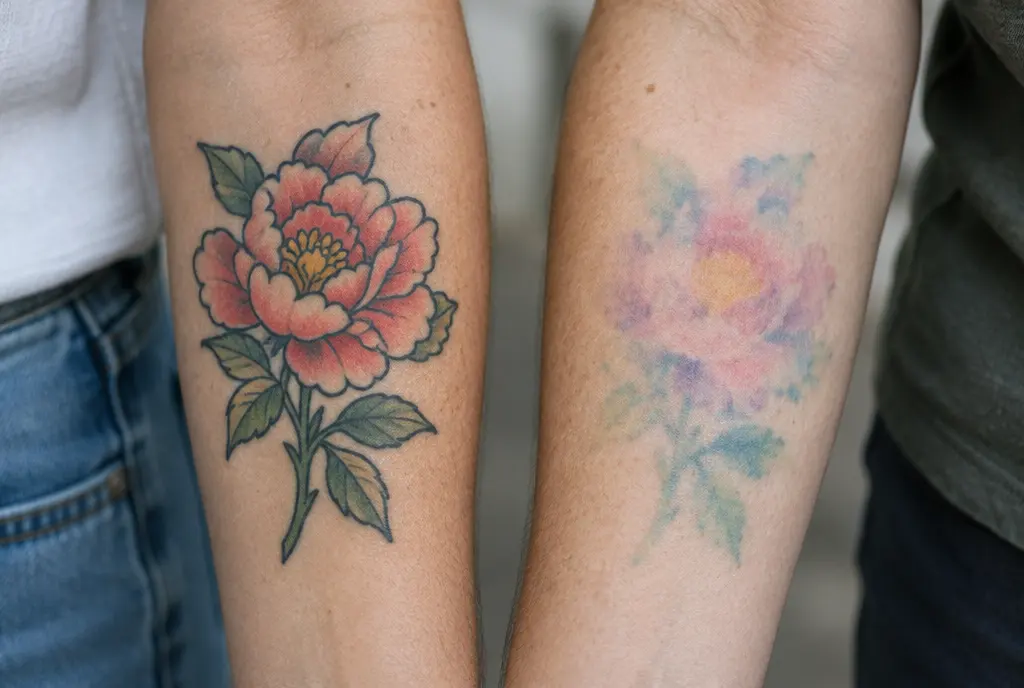
Colour realism can be stunning, but it has more variables. Pale tones such as yellow, light pink, pastel blue and white highlights usually fade faster than deep reds, blues and black, and they don’t all fade at the same rate. Over a decade or two that can shift skin tones and soften the sense of light. Colour realism ages best when the artist builds a solid value structure underneath, so that the picture still works in black and white, with colour as a layer on top.
Size: give the face room
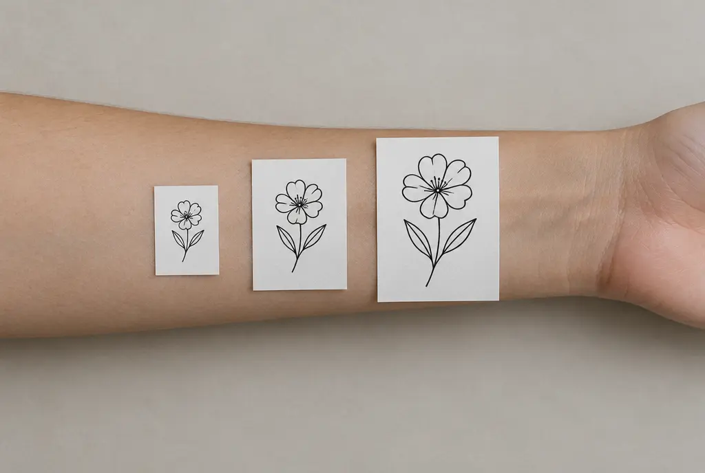
Realism needs space for its gradients. A realistic eye drawn at one centimetre has the same number of tones as one drawn at three, but packed into a third of the room. When those tones drift together, the small one merges into a dark spot while the large one still looks like an eye.
That is why many realism artists set a minimum size, especially for portraits. A common recommendation is a face of at least about 10–12 cm, and many artists prefer more for a portrait with hair, hands or a background. Smaller pieces are possible, but they have to be simplified, and they tend to lose features within the first decade.
- One subject, enough room. A single face, animal or flower ages better than a crowded collage squeezed into the same space.
- Simplify the background. Soft smoke or a clean dark backdrop frames the subject; tiny background details mostly blur into tone.
- Let the key features be large. Eyes, the line of the mouth and the main shadows carry a likeness for decades. Eyelashes and fine hair strands will soften first.
- Leave some skin. Untouched skin is the brightest white you will ever have. A few clean highlights do more for longevity than any white ink.
The best placements for realism
Realism wants three things from a placement: a flat or gently curved surface big enough for the design, skin that stays relatively stable over the years, and as little sun and friction as possible. That narrows the classic choices down to a few spots.
Forearm
The forearm is the most popular place for realism, and for good reason: it is long, fairly flat and easy to show. The inner forearm is softer and more protected, and ages gently. The outer forearm is the side that gets sun when you drive, cycle or sit outside, so it needs more sun protection. A portrait or animal head fits well centred along the length of the forearm, with the face roughly between the wrist and the elbow rather than wrapping around the bone.
Upper arm
The outer upper arm and shoulder are excellent for realism. The surface is generous, the skin is stable and it spends much of the year under a sleeve. It also leaves room to grow a single piece into a half sleeve later. Many artists consider it one of the safest places for a first realistic portrait.
Calf
The calf is one of the most underrated realism placements. It is large, gently curved, relatively stable over the years and often covered for half the year. It is also a little less painful than many people expect. The back of the calf in particular suits tall compositions such as portraits, animals and statues.
Thigh, back and chest
For bigger work the outer thigh, the upper back and the chest give realism all the room it wants. The back is ideal for large, detailed scenes. The chest and stomach can change shape with weight changes and, for some people, pregnancy, which can distort a face more noticeably than a pattern.
Places to think twice about
Hands, fingers, feet and the front of the neck are hard on any tattoo, and especially on realism. The skin is thin, moves constantly, gets washed and rubbed all day and sees a lot of sun. Soft shading there tends to blur within a few years. Ribs and inner elbows are possible, but the skin stretches and creases, so subtle facial features can distort.
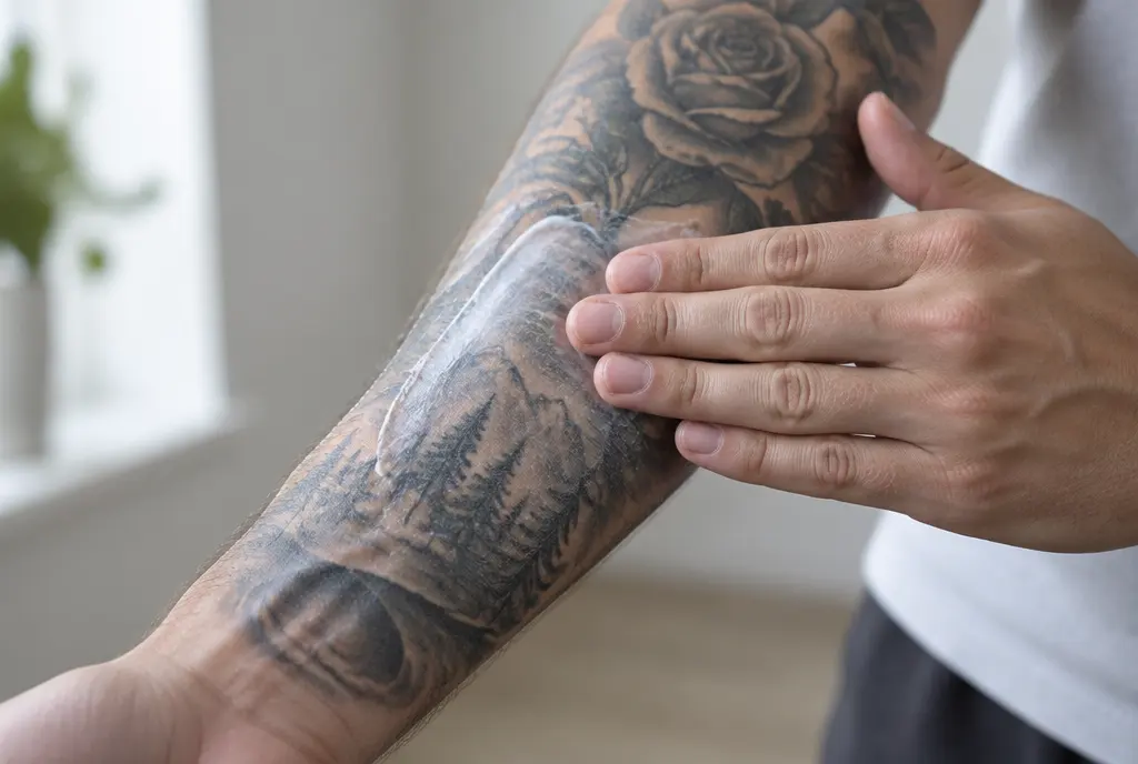
Portraits: the hardest test
A rose that softens a little is still a rose. A face that softens a little can stop looking like the person. Our eyes are extremely sensitive to faces, and a few millimetres of change around the eyes or mouth is enough to alter a likeness. That makes portraits the most demanding thing in tattooing, both on the day and over the decades.
A few things make a lasting portrait much more likely. Start from a sharp, well-lit reference photo with clear shadows, not a blurry or flat phone picture. Keep the face large. Choose an artist who specialises in portraits, not just realism in general. And accept that the portrait will gradually look more like a painting of the person than a photograph. That is normal ageing, not failure.
Touch-ups and long-term care
Realism benefits from maintenance more than most styles. Many artists suggest a first check after healing, then a refresh of the darks and highlights whenever the piece starts to look flat. As a rough guide, colour realism often needs a touch-up within about 5 to 10 years, while well-done black-and-grey work can often go 10 to 15 years or more, depending on placement, skin and sun.
A touch-up on realism is not just going over the lines. The artist usually deepens the shadows, restores contrast around the eyes or the brightest points, and sometimes adds a little more black to separate tones that have drifted together. Ideally, go back to the artist who made it, or to another specialist in the same style.
Between touch-ups, the best thing you can do is protect it from the sun. Keep a fresh tattoo covered while it heals, then use a broad-spectrum SPF 50 whenever it is exposed. Moisturised skin also shows shading more clearly, which is why a realism piece can look brighter after a few days of good care.
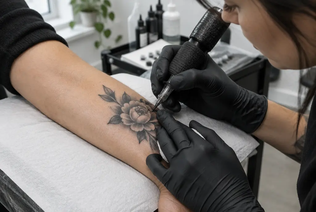
How to choose a realism artist
Realism is a specialist skill. A great traditional or fine line artist is not automatically a realism artist, and it is worth taking time to find the right person.
- Look for healed work. Fresh realism photos look perfect almost by default. Ask for photos of pieces that are at least one year old, ideally several. If an artist has none, that tells you something.
- Check the contrast in their portfolio. Look for real blacks and clean highlights. Portfolios that are pale and soft all over may look elegant on day one but have little margin for time.
- Look for your subject. If you want a portrait, look for portraits. If you want colour realism, look for healed colour pieces on skin similar to yours.
- Listen to their advice on size and placement. A good realism artist will tell you if your design is too small or your chosen spot isn’t ideal. That is a sign of experience, not difficulty.
- Expect several sessions. Large realism pieces are often done in more than one sitting, with healing time in between. Rushing a portrait into one long session rarely helps.

See it before you commit
Even with the right artist, it can be hard to imagine how a realistic piece will look at your size, in your spot, years from now. InkAge lets you upload a photo of the area and your design and see it fresh, healed and as it is likely to look after 10, 30 and 50 years. If the face turns muddy in the 30-year image, try a bigger size or a placement with less sun before you book. It is an estimate, not a promise, but it is a useful start for the conversation with your artist.
Marco, in the end, made his grandmother’s portrait a few centimetres bigger than he first planned and let the artist darken the background. Years later, she is still laughing at something just outside the frame.
Read alsoTattoos that age well: the styles, designs and spots that still look good in 30 yearsThe short version
Realism is the most photographic style in tattooing, and that is both its magic and its weakness. It lives on soft shading, and soft shading is the first thing time and sun take away. Give it strong contrast, enough size and a placement like the forearm, upper arm or calf, keep it out of the sun, refresh it now and then, and choose an artist whose healed work you have actually seen. Do that, and a realistic tattoo can stay recognisable for decades.
Realism: every body area
Frequently asked questions
Do realism tattoos age badly?
Not necessarily, but they have less margin than bold styles. Realism is built from soft shading, and the light midtones are the first thing time and sun soften. Well-planned realism with strong contrast, enough size and good sun protection can stay recognisable for decades; small, pale pieces tend to blur within years.
Does black-and-grey realism last longer than colour realism?
Usually, yes. Black pigment is the most stable ink, and black-and-grey relies on contrast rather than on pale colours. Colour realism can last well too, but light tones such as yellow, pink and white highlights tend to fade sooner, so it often needs a touch-up earlier.
How big should a realistic portrait tattoo be?
Many realism artists recommend a face of at least about 10–12 cm, and more if the design includes hair, hands or a background. Smaller portraits are possible but have to be simplified, and fine features such as eyes and lips tend to merge sooner.
Where is the best place for a realism tattoo?
The forearm, upper arm and calf are the classic choices: large, fairly flat surfaces with stable skin. The outer thigh, upper back and chest suit bigger pieces. Hands, fingers, feet and the front of the neck are the hardest places for soft shading.
How often does a realism tattoo need a touch-up?
It varies with placement, skin and sun. As a rough guide, colour realism often benefits from a touch-up within about 5 to 10 years, while well-saturated black-and-grey work can often go 10 to 15 years or more. A touch-up usually restores the darks and highlights rather than redrawing lines.
Sources
Do you run a tattoo studio? Show guests their tattoo at 10, 30 and 50 years
Written by the InkAge editorial team from widely accepted tattoo-care practice. Figures are rules of thumb, not measurements. This is general information, not medical advice — ask your artist or a dermatologist about your own skin.
Last updated: 8 November 2026