In short
- Ink sits beneath the top layer of skin, so your skin tone acts as a filter: contrast comes mainly from line weight and dark values.
- Black, saturated red, purple and deep blue usually show well; pastels, white and very light shades often barely show.
- Keloids and post-inflammatory hyperpigmentation can be more common on darker skin – tell your artist and consider a small test tattoo.
- The biggest decision is the artist: look for someone whose portfolio includes healed work on skin tones similar to yours.
In this article 12
- Why does ink look different on darker skin?
- Contrast is your best friend
- Colours: what shows and what disappears?
- Styles that work well
- Size and detail: give the design room
- Keloids and hyperpigmentation: what to know
- How to choose an artist
- Healing and aftercare on darker skin
- The passing of time: how tattoos age
- Try it on your own skin first in InkAge
- The one thing to take away
- Frequently asked questions
It’s Saturday afternoon, you’re sitting in the studio, and the artist holds the printed design up to your arm: a delicate, watercolour-style flower in pale pink, lavender and a touch of mint green. On paper it’s beautiful. Then you look at your own skin and a question comes up that maybe nobody asked on your behalf: will it actually look like this on me? Most of the designs you see on social media are photographed on lighter skin, which makes it easy to assume every design looks the same on everyone.
This article explains how ink behaves on darker and deeper skin tones, which lines, colours and styles give a truly strong, lasting result, what to watch for during healing, and how to choose an artist who really understands your skin. You won’t get a list of bans, but a map: darker skin isn’t an obstacle, it simply calls for a different design logic. And if you plan well, the result can stay beautiful for decades.
Why does ink look different on darker skin?
A tattoo artist doesn’t put ink into the very top layer of skin but into the layer beneath it, the dermis. The top layer, the epidermis, contains melanin – the pigment that gives you your skin tone. So the ink always sits “under” your own skin, and everything you see of it reaches your eye through that layer. The best comparison is a tinted window: put a pale lemon-yellow sheet behind the glass and you’ll barely notice it; put a deep black or vivid burgundy sheet there and it stands out clearly.
The more melanin in the epidermis, the stronger this “filter”. That’s neither good nor bad, it’s simply physics: light colours lose contrast, while dark ones keep it. That’s why the same design takes on a completely different character on light and deep skin. So the question isn’t whether you “can” get tattooed on darker skin – of course you can – but what creates the contrast.
It’s also worth knowing that darker skin isn’t a single category. There’s a huge range of shades, from warm browns to deeper, cooler tones, and your undertone (warm, neutral, cool) also affects how a given colour reads. What looks vivid on one person can look more muted on another. That’s why a test on your own skin is worth more than any general rule.
Contrast is your best friend
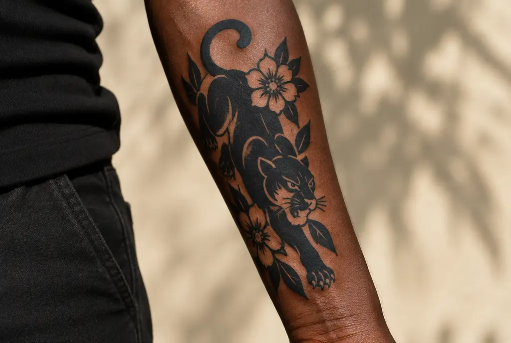
If you remember one thing from this article, make it this: on darker skin, contrast comes mainly from line weight and dark values, not from pale colours. A confident, sufficiently bold outline reads from a distance and holds its shape far better over the years than a hair-thin line.
Line weight
Fine single-needle lines tend to spread and soften a little over time on every skin tone. On darker skin there’s the added factor that a thin line gives less contrast to begin with. A medium or bolder outline, on the other hand, gives the design a “frame” within which colours and shading also come through better. Not everything has to be bold, but it’s worth anchoring the main shapes with a strong line.
Negative space
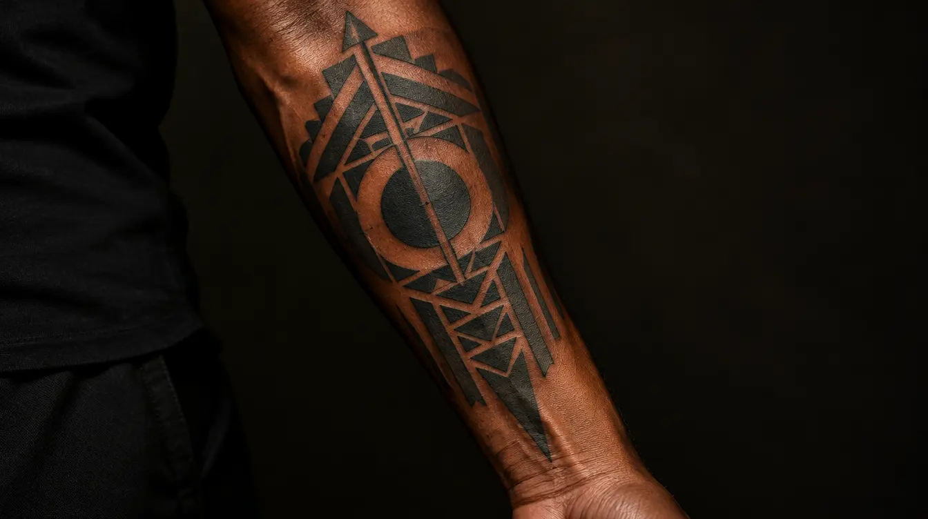
Negative space is the area with no ink, where your own skin shows. On darker skin this can be a beautiful tool: your skin itself becomes one of the colours in the design. Clean bands of skin left between solid black areas create a strong, graphic effect and stay readable over time. If a design is too crowded, the details merge – if it has room to breathe, every element survives.
It’s also worth thinking about the balance between outline and fill. A design where the dark and the light (skin-coloured) areas are roughly in balance looks much “cleaner” than one where every millimetre is covered in shading. Less really can be more here: a few strong decisions rather than lots of hesitant gradients.
Colours: what shows and what disappears?
Colour tattoos can be gorgeous on darker skin too; you just need to choose deliberately. In general, deep, saturated colours behave best, because they’re dark enough to come through the skin’s “filter”. The exact result also depends on your skin tone, the ink quality and the artist’s technique, so these are guidelines, not guarantees.
- Black: the most reliable, gives the best contrast on every skin tone and lasts the longest.
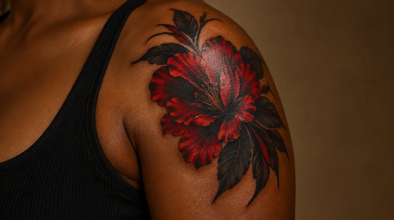
- Saturated red and burgundy: often surprisingly vivid, especially on skin with warm undertones.
- Purple and deep blue: can work well, particularly when framed by a strong outline.
- Dark green and emerald: show nicely on many skin tones; lighter greens less so.
- Pastels, pale yellow, baby pink: often barely show and can easily blend into the skin over time.
- White ink: on darker skin it often fades quickly, and for some people it can look more like a slightly raised, scar-like mark – worth discussing with your artist beforehand.
If you really want a lighter shade, think of using it in a small area, framed in dark, as an accent rather than the main colour of the design. A light highlight can work within a dark composition, but an all-pastel design often disappoints.
Don’t forget that inks differ too: the same “red” from two manufacturers, or in two different shades, can behave quite differently in your skin. That’s why it helps if your artist has worked on similar skin tones before and knows which of their pigments give reliable results. Feel free to ask why they recommend a particular colour.
Styles that work well
Some styles almost seem “made for darker skin”, because they’re built on contrast from the start. That doesn’t mean you can only choose from these – rather, they make a confident result easier to achieve.
- Blackwork and tribal-inspired designs: large black areas, strong shapes, clean negative space. Timeless and very striking.
- Traditional style: bold outline, a limited, saturated palette. It has stayed popular for decades because it ages well.
- Neo-traditional: more detail and colour, but still with strong lines – a good compromise if you want colour.
- Black-and-grey realism with strong contrast: can work if the artist is bold with deep shadows rather than relying on mid-tones.
- Lettering and script: beautiful when large enough and with a bold line; tiny, delicate handwriting easily runs together.
Fine line and very small, intricate designs aren’t off-limits, but they carry more risk: they have less contrast and can fade more easily over time. If you love that style, go bigger and keep the composition simpler.
Size and detail: give the design room
One of the most common mistakes is cramming too much detail into too small a space. That’s a problem on every skin tone, but it shows sooner on darker skin, because subtle gradients give less contrast to begin with. A slightly larger design with fewer but more confident details almost always ages better.
Think about the design as if you were seeing it from a distance: is it recognisable from a metre or two? Is the main shape readable even when the smallest details soften a little over time? If the answer is yes, you’re on the right track. If the design only works up close or zoomed in, consider simplifying it or making it bigger.
The body part matters too. A larger, flat area – such as the outer forearm, upper arm or shoulder blade – gives lines more room and faces less friction than hands, fingers or ankles. If your design has a lot of detail, choose a spot where it fits comfortably, so nothing has to be squeezed into millimetres.
Keloids and hyperpigmentation: what to know
This is the part people talk about less, even though it matters. People with darker skin tones are more likely to develop keloids – thickened, raised scars that can grow beyond the edges of the original wound. Post-inflammatory hyperpigmentation can also be more common: after an injury or inflammation, the skin temporarily forms a darker patch around the area. The latter often fades by itself over months, but it takes patience.
This doesn’t mean you can’t get tattooed, only that it’s worth preparing. If you or close family members have had keloids, or if an ear piercing, an old cut or a surgical scar healed raised, be sure to tell your artist. If you’re unsure, the best move is to check with a dermatologist beforehand – they can tell you how likely the risk is for you.
- Tell your artist if you’ve had keloids before or tend to develop dark patches.
- Ask for a small test tattoo in a less visible spot and wait to see how it heals.
- Choose an artist who works with a gentle technique and doesn’t “overwork” the skin.
- If the area starts to thicken, itch or grow during healing, see a dermatologist.
How to choose an artist
On darker skin, the artist’s experience may matter even more than elsewhere. Depth, needle speed, line weight and colour choice are all decisions where routine counts for a lot. A good artist won’t push a pale pastel design on you just because it’s trendy – they’ll tell you what will really show on you.
The best artist isn’t the one with the prettiest fresh photos, but the one whose healed work is convincing too – on your skin tone.
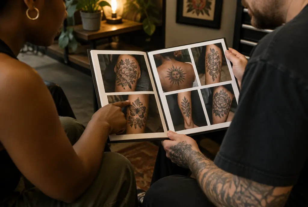
Look through the portfolio and specifically search for healed work on skin tones similar to yours. If you can’t find any, feel free to ask. An experienced artist won’t be offended – they’ll appreciate that you’re choosing deliberately. Also notice how they talk about your skin: if their answers are specific and honest, that’s a good sign.
The consultation is good for more than discussing the design. It shows you whether the artist listens, explains their decisions and is willing to adjust the design if that would work better on your skin. If you feel rushed or talked down to, feel free to walk away – a good tattoo starts with patience and trust.
- Look for healed work in the portfolio on skin tones similar to yours.
- Ask which colours and line weights they recommend for your skin.
- Talk about any tendency towards keloids or dark patches.
- Ask about touch-ups: after how long and on what terms they’re available.
Healing and aftercare on darker skin
The basics of healing are the same on every skin tone: keep it clean, use a thin layer of unscented balm, and avoid sunbathing, pools and long baths for the first weeks. On darker skin, though, it’s worth being even more careful not to irritate the area: don’t scratch, don’t pick the scabs, and don’t use strong, fragranced products. Every bit of extra inflammation can raise the chance of dark patches.
While healing, a tattoo goes through several phases: first it’s vivid and a little swollen, then comes peeling and a “milky”, cloudy stage when the design looks duller. This is completely normal, and on darker skin this cloudy phase can sometimes be more noticeable. Don’t judge the final result in the first weeks – a tattoo usually shows its true face after a few weeks, sometimes a month or two.
If during healing you notice strong redness, increasing pain, pus or a fever, don’t wait: these can be signs of infection and need a doctor’s check. On darker skin, redness can sometimes be less obvious, so pay attention to warmth, swelling and how the pain develops, not just the colour.
The passing of time: how tattoos age
Every tattoo fades and spreads a little over the years; that’s part of how skin naturally works. On darker skin, well-planned, high-contrast designs hold up surprisingly well, because the main shapes stay readable even as the details lose some sharpness. Pale colours, however, can “disappear” into the skin tone sooner.
The sun is one of the biggest enemies of tattoos on every skin tone. Although more melanin gives some natural protection, ink can still fade under UV exposure, so sunscreen is useful after healing too, especially in summer and on sun-exposed areas. A touch-up years down the line can also do a lot to bring contrast back.
If you ever want a tattoo removed, it’s good to know that laser removal on darker skin calls for more care, because the risk of temporary or lasting changes in skin colour can be higher. In that case, go to a specialist who has experience with your skin tone and uses a laser with a suitable wavelength.
Try it on your own skin first in InkAge
One of the biggest uncertainties is that you always see the design on someone else’s skin. InkAge lets you flip that around: upload a daylight photo of your own skin, and the preview keeps your skin tone, so you see what’s true for you, not a generic illustration. The skin outline makes sure the design only lands on skin, not on clothing or the background.
Then you can follow how the design looks fresh and after 1, 10, 30 and 50 years. This is especially useful if you’re torn between two versions – say, a paler colour version and one with a stronger outline. The ink longevity score (0–100) gives you a quick sense of how durable the design may be, and the “same design elsewhere” comparison shows how the same design would change on another part of the body.
- Take a photo of the chosen area in natural daylight, without flash or filters.
- Upload the design and look at it across all five time points.
- Compare the paler version with the higher-contrast one.
- Download the PDF and take it to your artist so you can discuss it together.
The preview is, of course, an estimate, not a promise: the real result is also shaped by the artist’s hand, the ink and your skin’s individual reaction. But it’s a great way to make sure your first meeting with the design isn’t a surprise.
The one thing to take away
On darker skin, contrast is everything: a strong line, deep colour, clean negative space and an experienced artist – that way your design stays yours not just when it’s fresh, but decades from now.
Frequently asked questions
Does colour show on dark skin?
Yes, especially deep, saturated colours such as red, burgundy, purple, dark blue and emerald. Pastels, pale yellow and white often barely show and can blend into the skin over time. A strong outline helps every colour read better.
Is white ink a good idea on darker skin?
Usually it’s not the best choice. White ink often fades quickly on darker skin, and for some people it can look more like a slightly raised, scar-like mark. If you love the effect, talk it through with an experienced artist and consider a small test first.
I tend to get keloids. Can I still get a tattoo?
It may be possible, but it’s worth checking with a dermatologist first, because tattooing is a skin injury and keloids can form after it. Tell your artist about your history and consider a tiny test tattoo in a less visible place. Watch how it heals over a few weeks before committing to a larger piece.
Why does my new tattoo have a dark patch around it?
It may be post-inflammatory hyperpigmentation, a temporary darkening of the skin after irritation, which is more common on darker skin. It often fades on its own over months. Avoid scratching and strong products, protect it from the sun, and ask a dermatologist if it doesn’t improve or you’re worried.
Can I preview it on my own skin tone?
Yes – upload a daylight photo of your own skin and InkAge keeps your skin tone in every stage, from fresh to 50 years. You can compare versions and take the PDF to your artist.
Written by the InkAge editorial team from widely accepted tattoo-care practice. Figures are rules of thumb, not measurements. This is general information, not medical advice — ask your artist or a dermatologist about your own skin.
Last updated: 13 October 2026